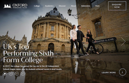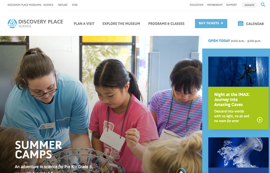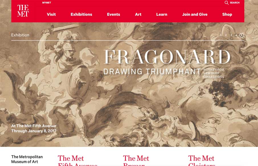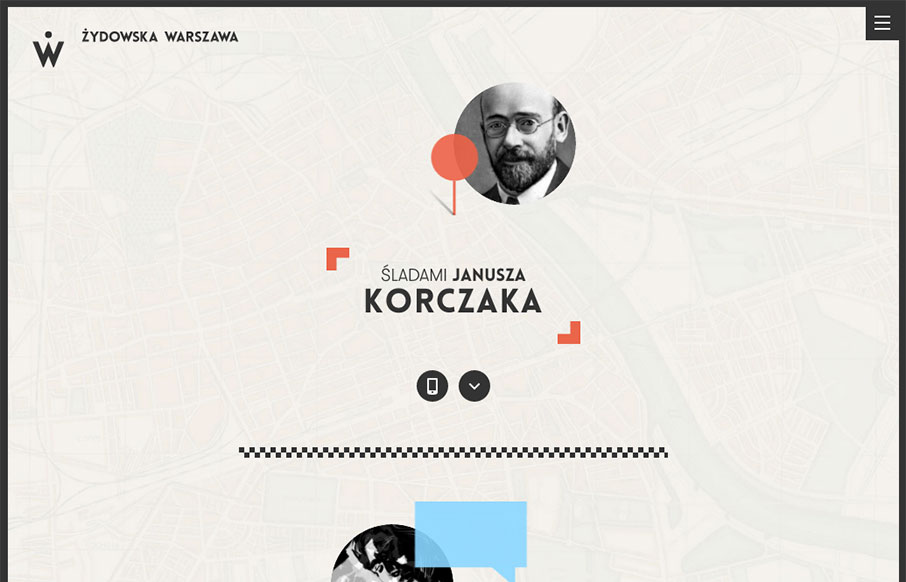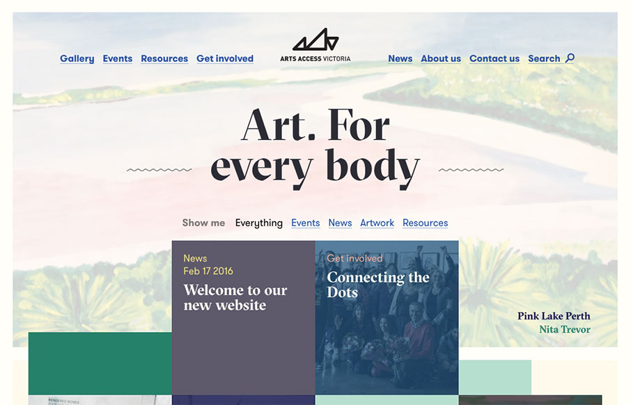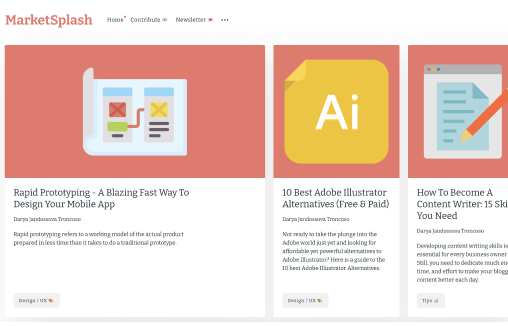
Clean 'bento' looking layout. Nice subtle scroll animations and the large images of the work let you see some good detail.
Klarna
Large and loud photography to tell the story of what it is that Klarna does. Good timing on the scroll animation sections and solid typography on top of all of it. Good stuff.
Wyse Meter
Super rich graphical design. Sharp photos and timing on the scrolling. I like it most at the point where it goes from the kinda "hero" section to the more content centric portions on the page. Solid work.
Okgreat
A nice mix between creativity and a clean interface with some funky fonts and sweet animations.
Roud Studio
Roud Studio’s creative website ingeniously displays usability in a unique and distraction-free way. With a focus on simplicity, it invites users to explore seamlessly, highlighting our innovative features without unnecessary clutter. Welcome to an online space where creativity meets functionality with a touch of unexpected delight.
Halo Lab
Halo Lab’s product-oriented website features a folder-based style, offering intuitive navigation with a streamlined, organized interface reminiscent of a well-curated portfolio.
GitButler
Very strong design for GitBuilder, I love the detail work put into the interactions and such. Very clean layout and just fun. https://youtu.be/-fJsKwL0jwE
Meat
Brutalist style design? I kind of like it, the mouse-overs on the hero section are a mystery to me though. Overall I dig the layout and design. Fun stuff.
Method
The design studio Method offers a visually delectable treat with their Bento box, brimming with sugared almonds. Their adept use of pastel hues and curved corners infuses a modern, upbeat ambiance into the design, creating an inviting and aesthetically pleasing...
Electra
Electra, a manufacturer of car charging hubs, presents a website that exudes modernity and cleanliness in a subtle yet compelling fashion. The design features rounded corners and seamless, animated interactions, elements that contribute to its understated yet engaging...
bitesized
Bitesized has ingeniously crafted a website, cleverly themed around the world of fast food. The concept is brilliantly executed, featuring a striking color palette that resonates with the fast food industry, along with impeccable use of display typefaces that capture...
Robin Mastromarino
Robin Mastromarino, an interface designer deeply intrigued by user interaction, crafts a site with a playful ambiance. Projects are ingeniously presented on a clickable wheel, and the seamless transition upon clicking a project, where the header image straightens...
Locomotive
Locomotive adopts a minimalist brutalist aesthetic for its portfolio, yet it infuses the design with engaging elements, such as animated interactions and image pixelations, which enhance the visitor's experience.
Steve Wolf Designs
Love the grid here. The juxtaposition of the type and images is solid. I like the little "flitter" of the photo before it loads into it's place on the grid, it's subtle, not subtle, and always makes you take note of the element.
Tux Karma
Tux Karma, an initiative by creative agency Tux, is dedicated to championing projects focused on social and climate justice. The website features a bold design, marked by vibrant, fluid backgrounds, and an array of distinct typefaces. Additionally, it incorporates...
Studio Feixen
Studio Feixen's portfolio strikingly exemplifies the art of infusing vibrance without inundating the user. A harmonious equilibrium between playful and sophisticated elements suggests a perfect fusion of personal flair and top-notch craftsmanship.
Six Eastern
Interesting overall interaction here making this side scroll. I'm not sold on it 100%, but it kinda works here - makes it all stand out. Good too that it's based on a foundation of solid visual design.
Skye High
Skye High employs oversized typography, with the motion cleverly confined to the background layer. The design's synergy is evident as the flying pages from the background animation interact with the letters, proving that an engaging visual doesn't require excessive...
Alfred
In the hero header, a bold, easily readable text layer smoothly scrolls from right to left. What stands out is the minimal word count, making reading during motion user-friendly. Moreover, this moving text layer is overlaid on an animated video roll, and the...
Grain & Morter
Beautiful, simple and clean design always wins. I love all the elements of this design - from the easy going type treatment to the fun illustration work, solid work.
kappow
Cool, almost minimal layout. I like the interaction when you move your cursor over the K - pretty neat/fun. I like how certain sections load for you as you scroll down the page, it really rewards the user well for exploring the content.
Lovi
Pretty nifty one-pager. I really like how the targeted scrolling sections draw you in and then help educate on the app's subject matter. Solid photo and detail work as well - i'd expect that from an AI based app too.
Faculty
I really, really love the simplicity in this design/layout. Simple isn't the right term, it's minimal. Which is super difficult to achieve and they've done it. Bravo.
Cybertruck
At first glance this page looks really simple and it is from a visual/layout perspective. But, at the same time there are some nifty things going on interaction wise as well as some really top-notch photography.
Google Gemini
Pretty good visual design from Google here with this page. I like the scroll-to infographics sections and the black background gives it a classy look.
Algorithm Design
Some real clever interaction stuff built on this website design. It's clearly directed toward more design savvy people and that's cool too, considering it's about AI driven design stuff.
Visual Electric
AI image generator... I like the ripple effect on the hero image area. That display type is pretty far out there - reminds me of sci-fi for sure.
faizur
https://youtu.be/4Mpo8VlkUHU Slick looking layout and design for this design service website. It has all the design details you'd expect to look very professional and trustworthy. Good job there! Check out the video to see what you think about the overall concept of...
Somefolk
Pretty rad look and feel to this website design. I love the oversized type and the colors used in contrast with the "dark" photography used. I also find it very interesting that the top part of this design starts to look like or at least interacts like a YouTube card...
Flayks
https://youtu.be/cb7dCitixm0?si=K1fk5ZTQZV5bZ6Ji Very interesting layout for the Flayks portfolio website, some cool typography work to stand it all up on. I like the green and orange colors - very trendy yet not really. I also very much like the work section and how...