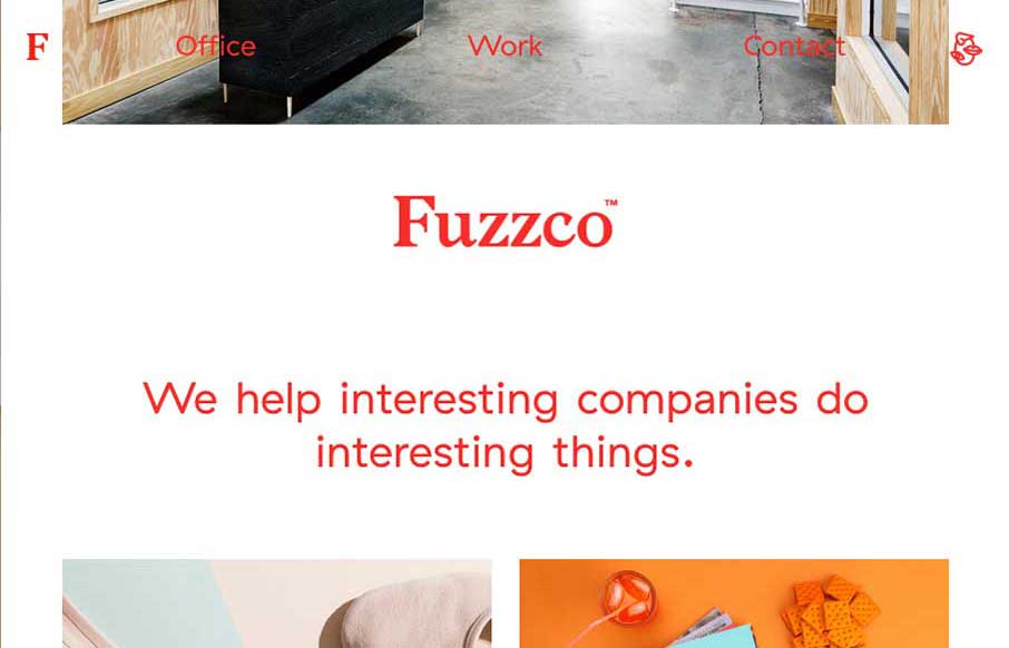
by Aaron Griswold | Feb 16, 2015 | Design Firm, Gallery
If you don’t like Fuzzco, then you’re probably just jealous you didn’t come up with that first. I’ve read some reviews of their new site – both good and bad – and hey, we all have opinions (insert colloquialism here). And why am I...
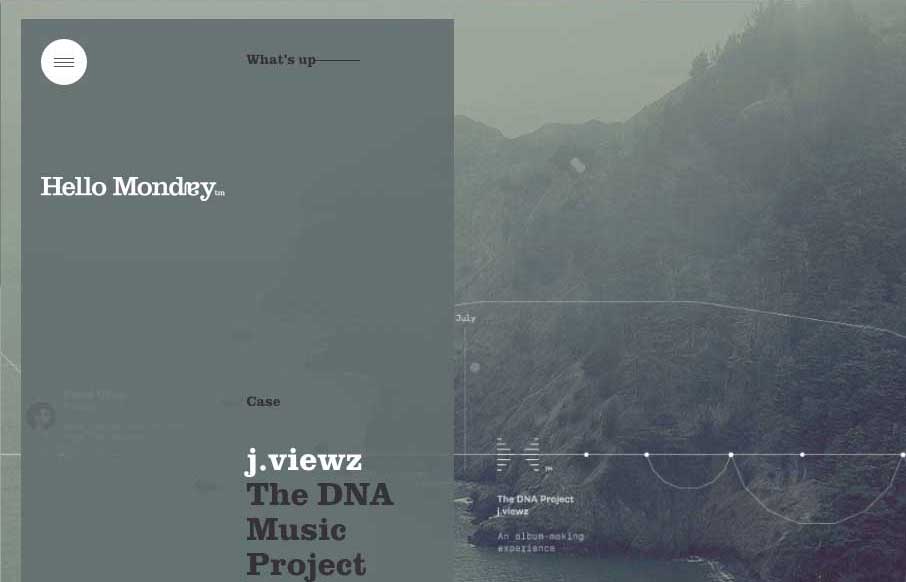
by Aaron Griswold | Feb 16, 2015 | Design Firm, Gallery
Excellent way to start Monday – with the agency site from Hello Monday, out of New York and Copenhagen. They do some really cool work, and their site is definitely different than most web design firms. From the parallax slider that rotates vertically, to the...
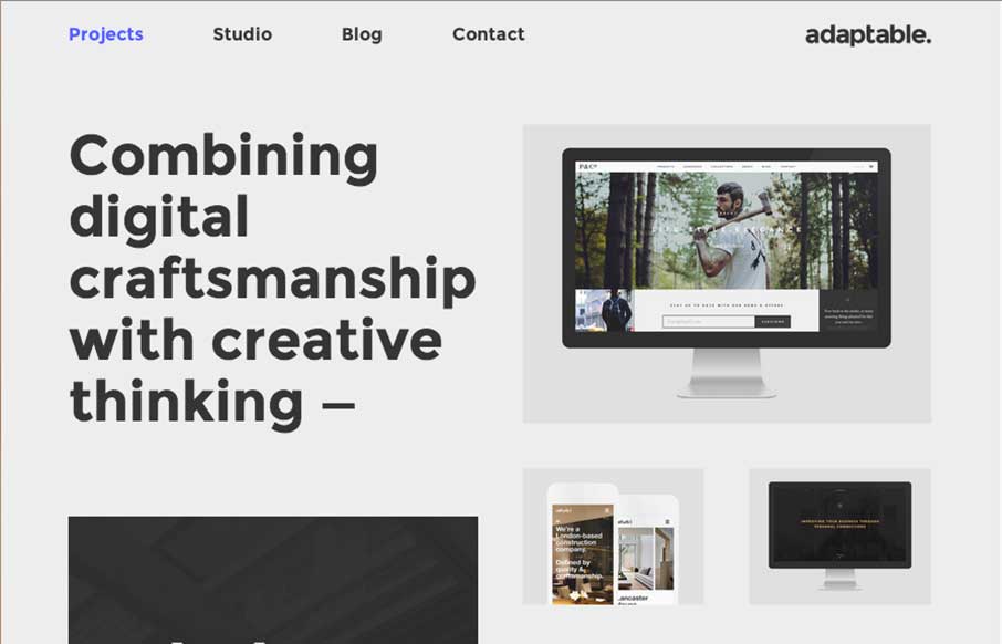
by Gene Crawford | Jan 12, 2015 | Design Firm, Gallery
I love this layout. It’s simple and to the point as well as a nice example of responsive design. The scaling of the main images is nicely done and in contrast the larger bolder type in the layout works our really well.

by Aaron Griswold | Jan 6, 2015 | Design Firm, Gallery
I like how Mad*Pow out of Portsmouth, NH has used their slider in a different fashion – less big image, more information. Also like how most of the coloring for the site comes from their examples of work – build a canvas, fill it up!

by Aaron Griswold | Jan 5, 2015 | Design Firm, Gallery
OK – let’s get the New Year started right! Here’s a great site from the Born Group out of New York and London. Great contrast throughout the site that’s exemplified with the video background of the 800 pound gorilla to start you out. Good...
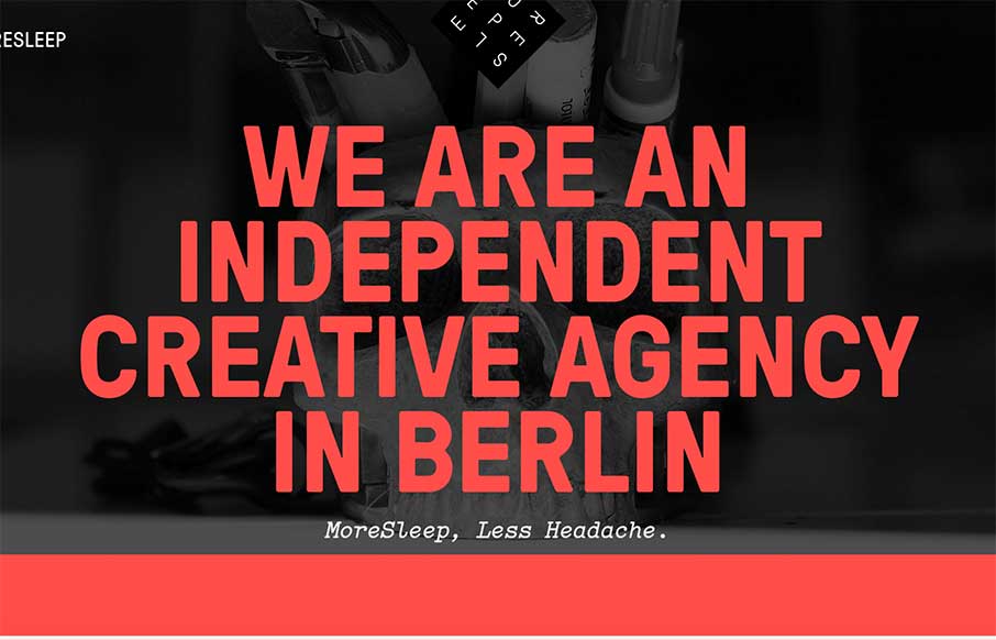
by Aaron Griswold | Dec 19, 2014 | Design Firm, Gallery
“More Sleep, Less Headache” – we should all be so lucky! The MoreSleep web design agency out of Berlin, Germany is promising that. Based on their website and portfolio of work, I would have to say “das ist richtig”. Like the off screen...