by Gene Crawford | May 16, 2016 | Design Firm, Gallery
Woah. That’s what I said when I first loaded this site up. It’s plenty full of visuals and good looking teaser imagery. It’s pretty solid in execution too. I love that first moment when you start to scroll this site down the most. It’s a nice...

by Aaron Griswold | May 10, 2016 | Design Firm, Gallery
Ah man – check out this site by Nature Digital out of LA. While I’m not as wild about sites that change the footprint of your cursor, it’s cool here with the video background. But what is really cool is the layout and movement of the case studies...
by Gene Crawford | Mar 30, 2016 | Design Firm, Gallery
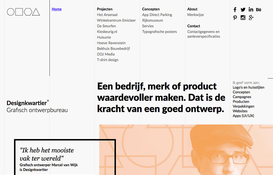
Super strong grid based design. The layout and details feel very scandanavian to me. I love it so much. It’s not responsive, which is a shame but I still love it. From the Designer: Graphic design agency Designkwartier aka Marcel van Wijk one-man-designstudio...

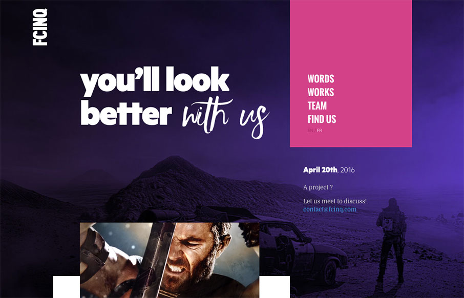
by Gene Crawford | Mar 30, 2016 | Design Firm, Gallery
Really cool full width layout with a strong grid based. It’s made up of largely squares and the grid, it really is a strong layout, it feels kind of “traditional” to me but the type and colors make it look really futuristic. Real solid design here....

by Gene Crawford | Mar 28, 2016 | Design Firm, Gallery
Very nice splash/hero type layout for the main page on Elespacio. My favorite section is the portfolio though. The way the image/photos are done to really pop off the page like they do. Solid.

by Gene Crawford | Mar 17, 2016 | Design Firm, Gallery
Yeah it’s a parody agency site, but it’s actually not that bad of a design. Fun stuff, but it works pretty well.