
by Gene Crawford | Sep 19, 2023 | Design Firm, Gallery
Very solid agency styled website design. I LOVE the use of large imagery and video like they’ve done here, much like Apple does with their stuff. The scroll interaction timing is well done and man, you just can’t go wrong with strong/clean typography!...
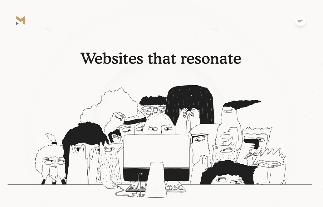
by Gene Crawford | Sep 18, 2023 | Design Firm, Gallery
Magnet Co’s website is modern and functional, with meaningful illustrations and a focus on SEO friendly content.

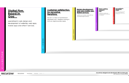
by Gene Crawford | Sep 14, 2023 | Design Firm, Gallery
I just LOVE the tight layout and grid that’s paired with such distinct differences in typographical choices. So solid. Different colors for each page/section just reinforces the thoroughness feeling behind the brand. Great work.
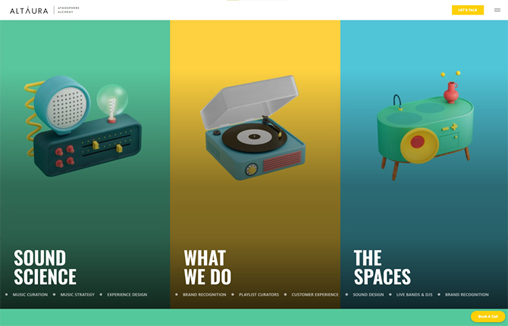
by Gene Crawford | Sep 13, 2023 | Design Firm, Gallery
A full service sound agency that provides music curation services and background music for businesses and brands. Based in London, UK and Santa Monica, US they create playlists and songs that increase revenue.
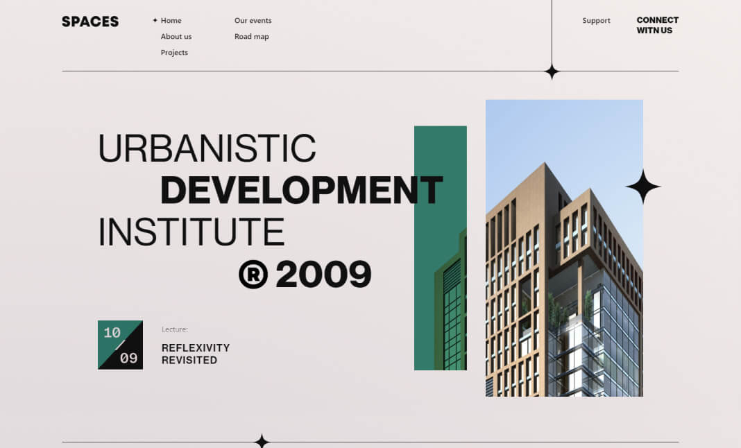
by Gene Crawford | Sep 13, 2023 | Design Firm, Gallery
Interesting design study for this website. The main layout IS the navigation. I can’t say how well this would work in a purely UX review but from a gallery/design perspective it’s worth the time and study.
by Gene Crawford | Sep 8, 2023 | Design Firm, Gallery
I don’t really care that this is webflow – it’s nice. You can study it as a template if you like. I love the scrolling interaction/animation. So clean and timed perfectly.