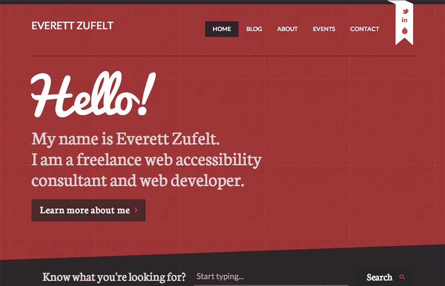
by Gene Crawford | Oct 11, 2012 | Blog, Gallery
The red and black design always works IMHO. Mixed with a nice grid and a diagonal it just comes off as smart. I like the subtle grid pattern that can be seen behind the design and the type mix works well with the grid vibe. I like that search form design a lot. Great...
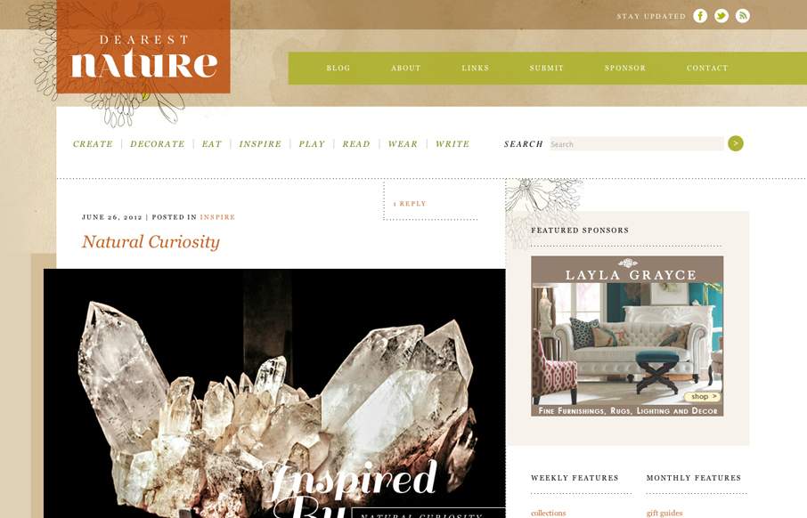
by Gene Crawford | Jul 2, 2012 | Blog, Gallery
Posted by: Donaville Herrick @dearestnature This site was 5 years in the making. The original concept behind the site arose while working on niche publications for my previous employer from 2007 – 2010. It wasn’t until 2011 that I hunkered down and mapped...
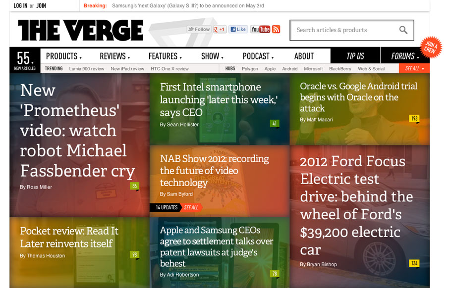
by Gene Crawford | Apr 18, 2012 | Blog, Gallery
The Verge isn’t exactly new news in the design world. It’s been around a few months. I happen to feel like it’s a great experience in terms of taking in news/stories, both on the old laptop and on my iPad too. What are your gripes or loves for...
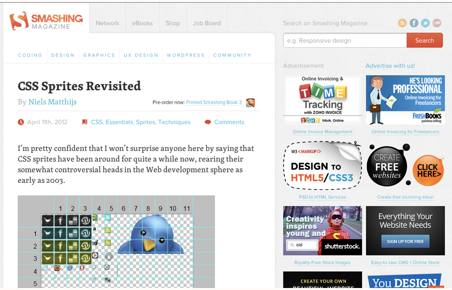
by Gene Crawford | Apr 13, 2012 | Blog, Gallery
Smashing Magazine is one of those industry staple websites right? Like Facebook, you mess with it people either love it or hate it. Giovanni and I explore the responsive design decisions in some detail (kinda) in our screen cast review. Overall we do really dig the...

by Gene Crawford | Mar 28, 2012 | Blog, Gallery
Beautiful blog/website design by the team (partly) that made Clear. I love the crystal comet and that animation and the overall character the design gives the site. The footer is well done too and carries the visual tone all the way through.
by Gene Crawford | Feb 28, 2012 | Blog, Gallery
Nice single page, responsive layout. I love the background texture and the weird illustrations – they’re just fun. Beautifully designed across screen sizes too.