by Giovanni DiFeterici | Mar 19, 2014 | Gallery
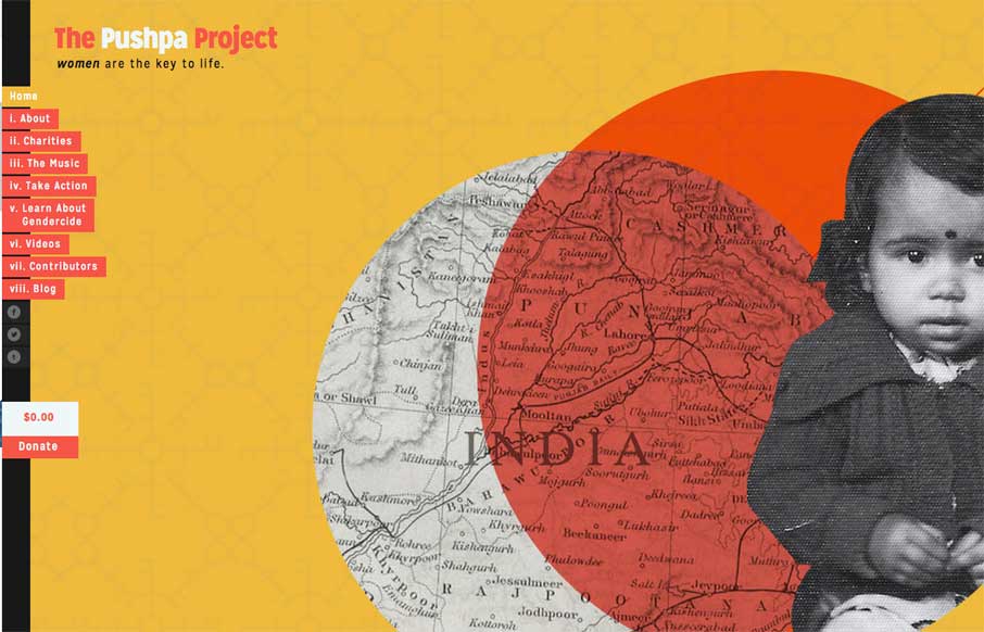
The Pushpa Project is a narrative site that seems to draw strongly from print design. The minimal color does a great job of focusing the reader’s attention on the text. I really enjoy the site’s primary navigation, which does a great job of reenforcing the...
by Giovanni DiFeterici | Mar 12, 2014 | News
The Problem Managing the way that content is presented is fundamental to web design. It’s pretty much all we do when you think about it. This basically amounts to planning how the content, which is usually much longer than the viewport, will appear as the page is...

by Giovanni DiFeterici | Mar 7, 2014 | Gallery, Marketing
Realtii does a great job of using animation to focus the user’s attention on key details. The colors are soft and friendly. A pleasant site with simple detailing.
by Giovanni DiFeterici | Mar 6, 2014 | Gallery, Portfolio
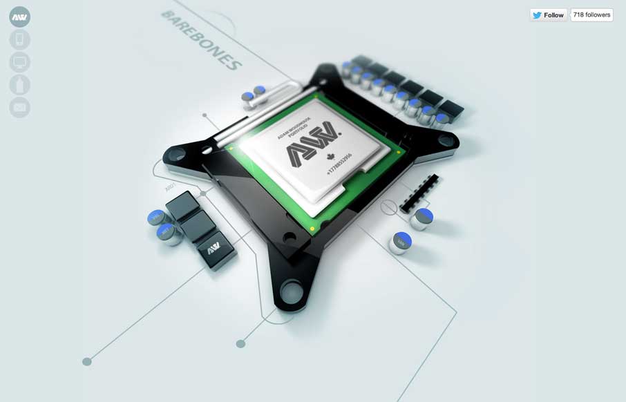
The Adam Woodhouse website is clearly a design intended to impress with lush, complex animations and a strong graphical sensibility. Not responsive, but beautiful nonetheless. Plus, Bender.
by Giovanni DiFeterici | Mar 5, 2014 | Food and Beverage, Gallery
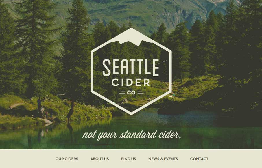
The Seattle Cider Company website uses flat illustrations and simple interactions to control the narrative of the cider making process. The design style is hip and minimal with a few nifty tricks (like the slide-in fixed nav) and a lot of character. The narrative...