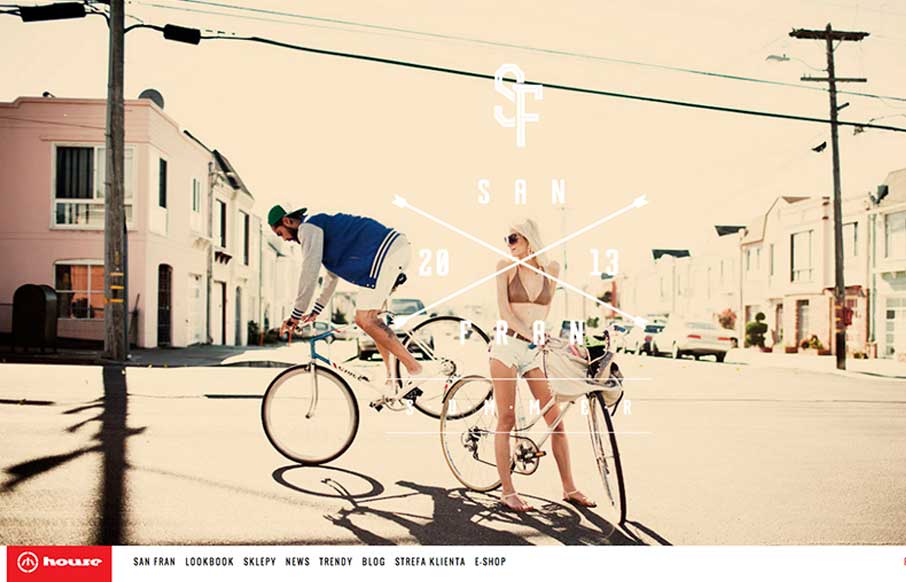
by Giovanni DiFeterici | Jun 20, 2013 | Gallery
House is strongly structured, albe it a little noisy design. The strong use of bold red and imposing lines is wonderfully graphic and paires well with the style of photography. The site is adaptive, which seems to work well enough in this case. Dig it.
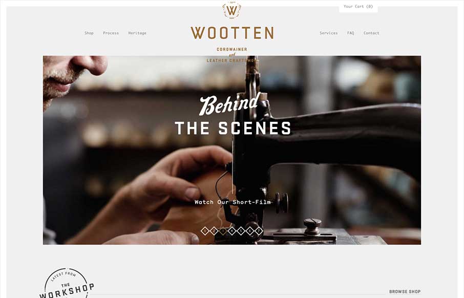
by Giovanni DiFeterici | Jun 19, 2013 | Gallery
Man this is a beautiful site. The photography really sells it. Just check out the heritage page. The mix of fixed imagery and scrolling text is beautiful and the transition between content blocks is perfect. The site has a handcrafted feel that perfectly compliments...

by Giovanni DiFeterici | Jun 18, 2013 | Gallery, Shopping
I really like how carreraworld has broken the grid. The site is well structured, but has loosened the hard lines of the grid it uses to create a more free flowing and energetic design. Nothing feels static. Even thought the design is wildly varies throughout the...
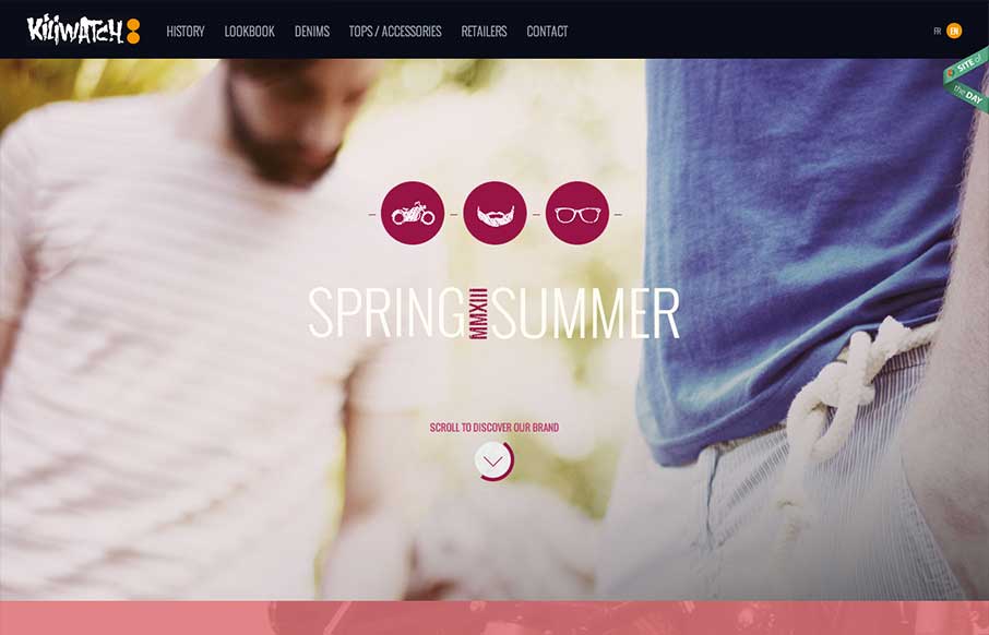
by Giovanni DiFeterici | Jun 13, 2013 | Gallery
Yet another beautiful product site, strongly driven via amazing photography. Can’t say enough about how beautiful I find the mix of colors, imagery and typography. I’m a little worried about all of the loading screens we’ve been seeing lately, but...
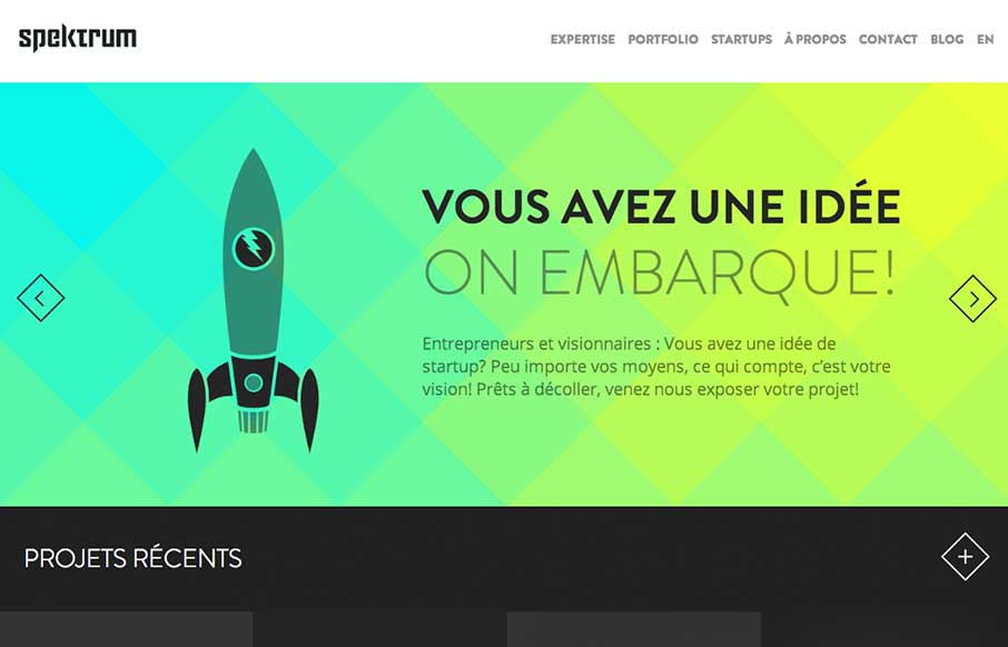
by Giovanni DiFeterici | Jun 12, 2013 | Gallery
Spektrum is a beautiful site with tons of eye candy. The canvas animations on the homepage are stellar. They overflow with character and cleverness. I can’t get enough of that kind of thing. I really enjoy the way that they’ve worked up the...