by Gene Crawford | Apr 4, 2012 | Gallery
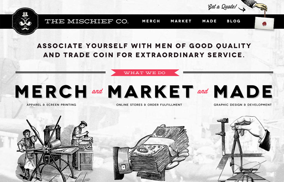
The Mischief Co’s visual branding is quite fun. It’s somewhere between olde school and future classy (heh, I just made that up.) But I love it, it’s fun and that’s just what a site like this needs right? Technically it’s put together well...
by Gene Crawford | Mar 29, 2012 | News
Here are some friendly points and reminders about how to prepare and make the most out of your conference experience. At least these are things that I tend to have to remind myself to do before, during and after a great conference. We’re also giving away a set...
by Gene Crawford | Mar 28, 2012 | Gallery
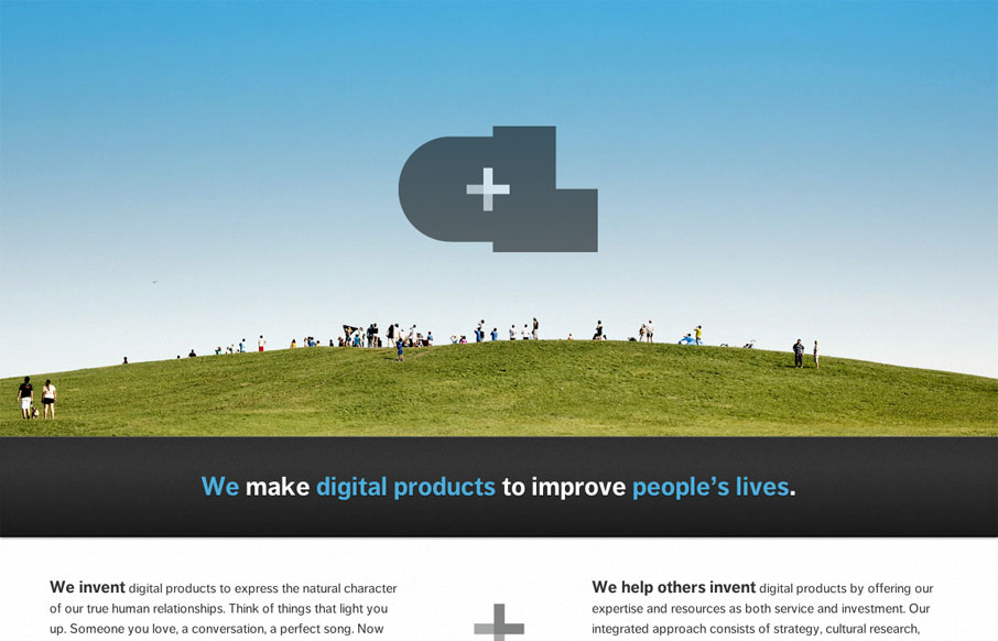
The new Crush Lovely website is simple and direct. I really dig how the tone is mainly delivered with copy and such. The “select clients” and “imagined future clients” stuff is pretty smart. The super large contact form with the large text box...
by Gene Crawford | Mar 28, 2012 | Blog, Gallery
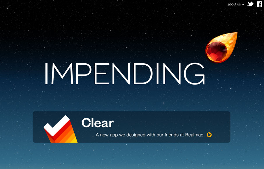
Beautiful blog/website design by the team (partly) that made Clear. I love the crystal comet and that animation and the overall character the design gives the site. The footer is well done too and carries the visual tone all the way through.
by Gene Crawford | Mar 28, 2012 | Gallery
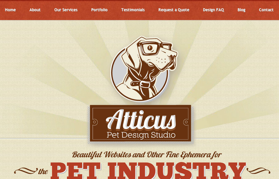
Very tight design. I like the animated background image around the logo/illustration. I particularly like the effectiveness of the footer area/contact form. The experience of going from page to page and getting the slide down effect is pretty cool, but gets a bit...
