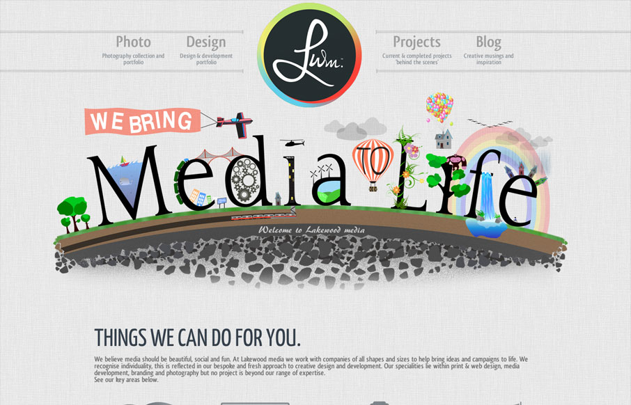
by Gene Crawford | May 29, 2012 | Gallery
With this website we have aimed to achieve an impacting first response using unique designs and layout. Being a little different is what its all about, the Lakewood media website somehow stays conventional but steps over the perimeter of the norm. A flowing layout has...

by Gene Crawford | May 24, 2012 | Gallery
I love the simplicity of the thoughtbot website design. The interactions on the home page portfolio images is really smartly done. The hierarchy is kept simple and gets more dense with content as you scroll down the page, with very minimal copy until after you see the...
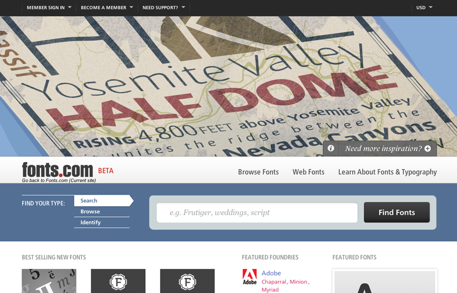
by Gene Crawford | May 24, 2012 | Gallery
Looks as if Happy Cog just rolled out a new design for fonts.com. Here’s a super detailed blog post about it. I like a lot of this new design. My particular favorite is the main image slideshow and how the main site colors change out as you experience it. Good...
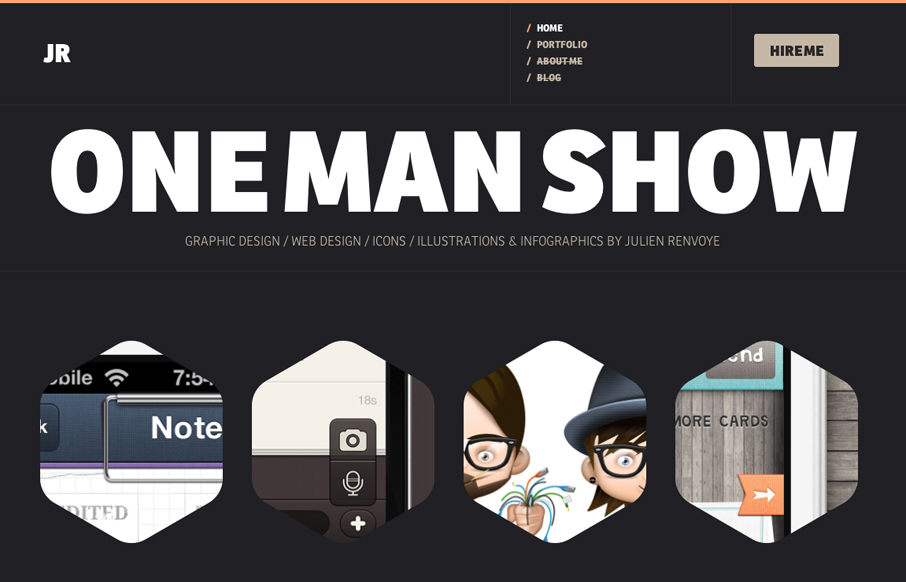
by Gene Crawford | May 24, 2012 | Gallery
Really great interaction design on this portfolio website. I love the hexagons and how they grow a bit when you mouse over them. The way the headers load when you hit a new page is a nice little surprise too. Lovely bold yet minimal color palette. Really enjoyed...
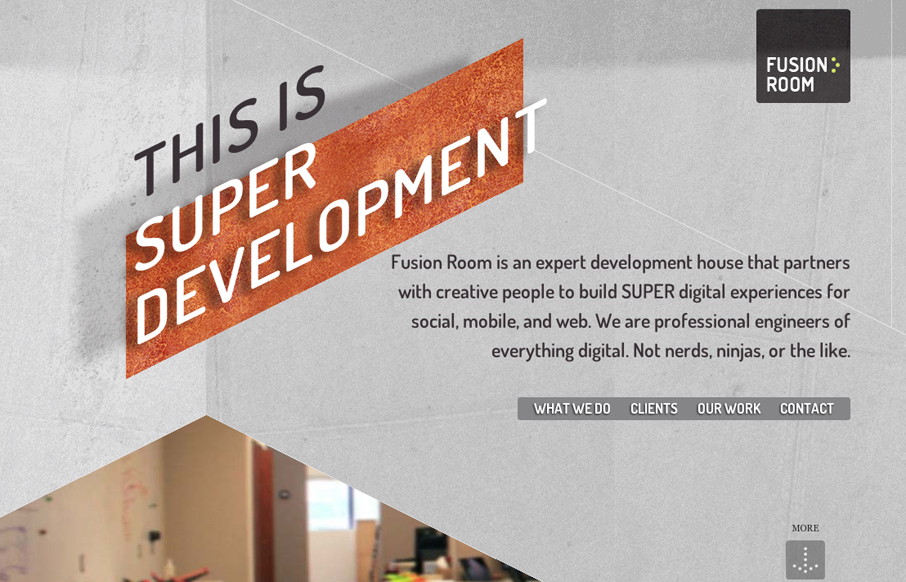
by Gene Crawford | May 23, 2012 | Gallery
Really nice scrolling, single-page website design. I really like how the elements slide into view as you scroll down the page. The diagonal movement is very dynamic compared to most parallax technique sites like these. Lovely.
