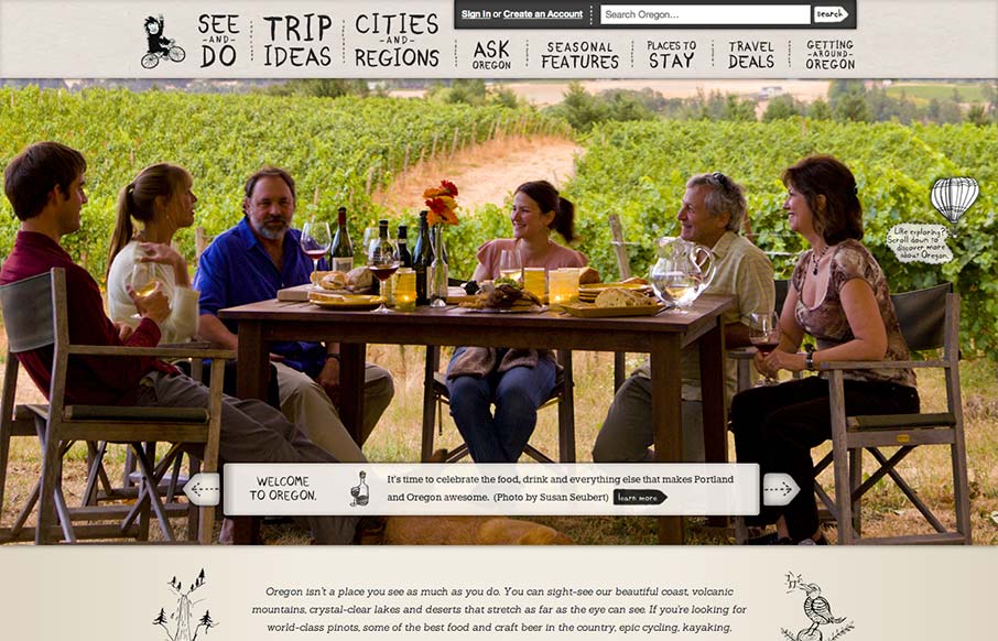
by Gene Crawford | Sep 27, 2012 | Gallery, Travel
Oh man, I love this design. There’s so much going on here with the responsive design. The search box has some interesting changes across screen sizes, which is worth some study. I also really like how the main hero/slide show is done, where when you get down to...
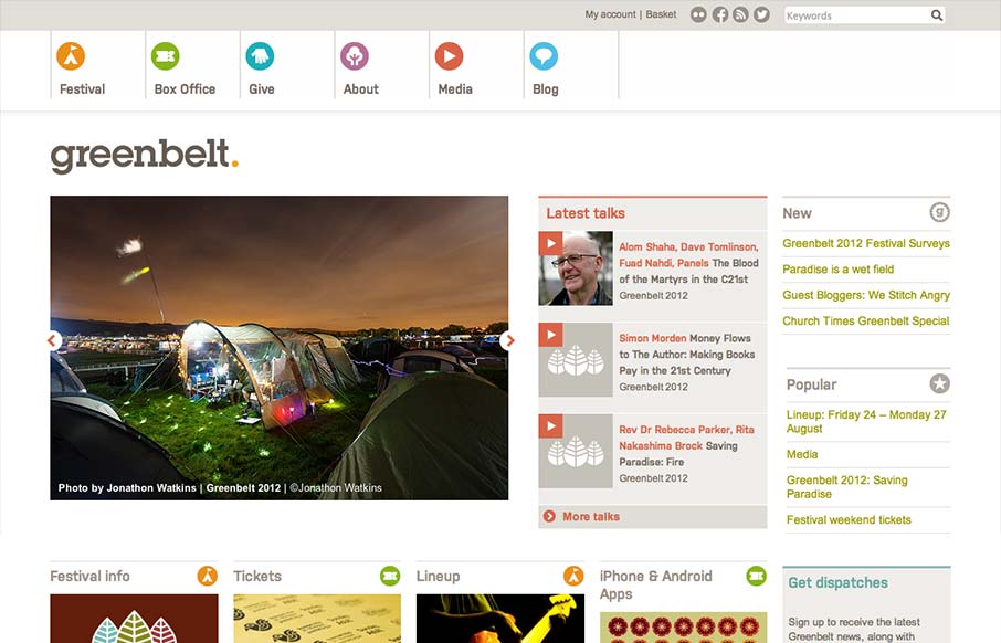
by Gene Crawford | Sep 27, 2012 | Gallery
Nice responsive work here. I like the changes in the main hero/slide show area and the column work in the image blocks under it. I also really dig the menu icon/link that shows up in place of the main nav, they keep the icons near those nav links which is really...
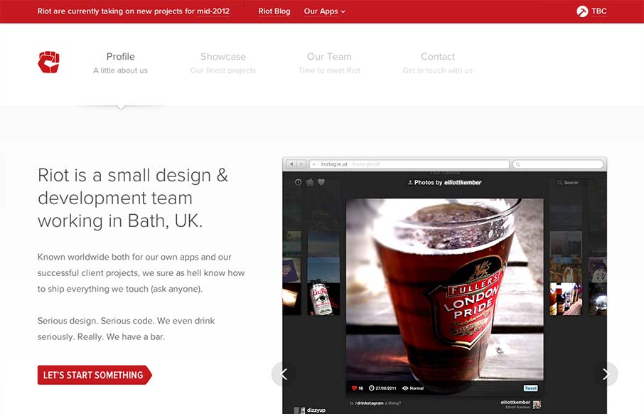
by Gene Crawford | Sep 26, 2012 | Gallery
Very nice clean looking design. I love how the “out apps” is used to slide down from the topmost header area. It’s a tight design all the way through too. Great looking work.
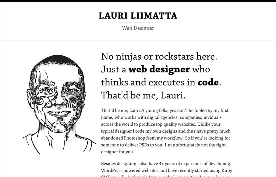
by Gene Crawford | Sep 26, 2012 | Gallery
Submitted by: Lauri Liimatta @laurilii Role: Designer & Developer My new redesigned portfolio. Responsive design and powered by Kirby CMS. I like the design approach of going light to dark from top to bottom, or light to dense visually. However you want to look...
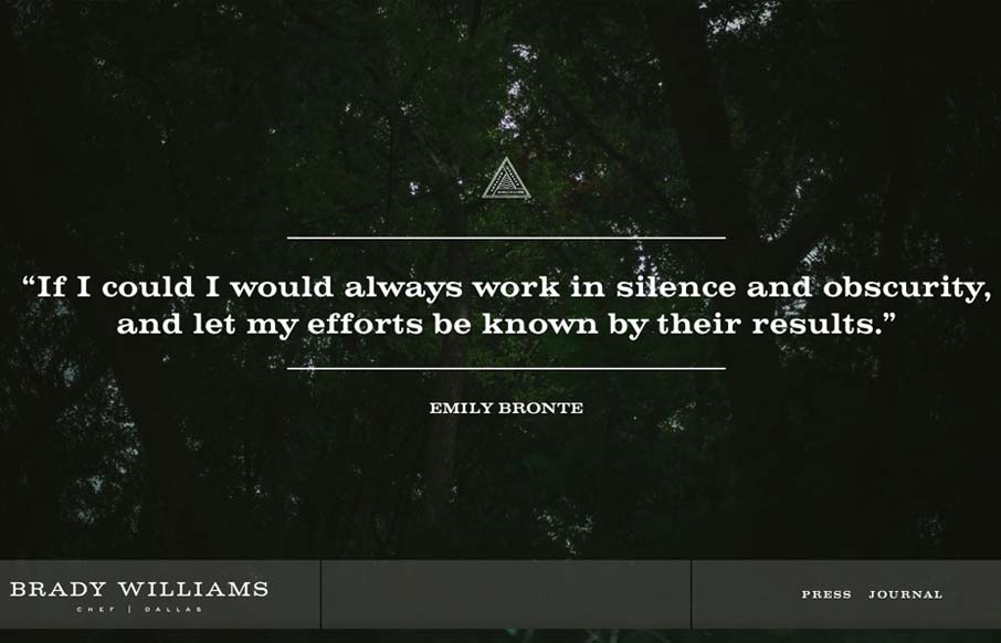
by Gene Crawford | Sep 26, 2012 | Food and Beverage, Gallery
“Brady Williams, a chef in Dallas, TX, shows his craftsmanship and passion for the culinary arts in this elegantly simple website. Personal sites tend to focus on the maker first, and the things created second. Not so here. Brady shows his passion, he...