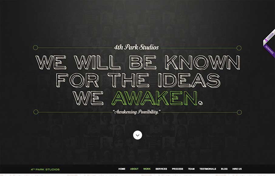
by Gene Crawford | May 22, 2013 | Gallery
The 4th Park Studios site is a great design. There’s a great feeling for timing as you scroll down the page, which makes it feel very complete. The site looks like it’s based on this theme, but they’ve changed it out and used it as a base. Overall...
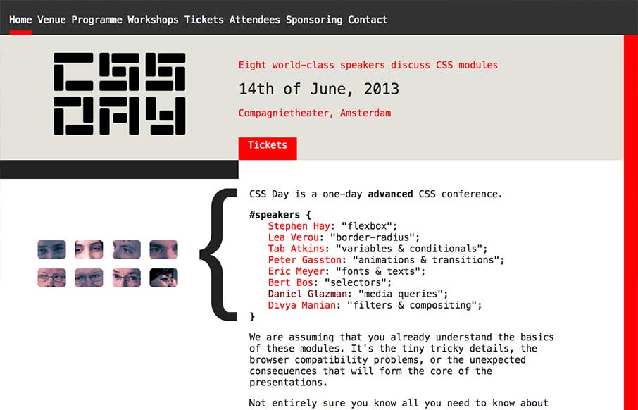
by Gene Crawford | May 21, 2013 | Conference, Gallery
What a great simple concept for a conference website. It’s super appropriately designed for the audience and for the subject matter. I LOVE stuff like this. I’ll also let Cameron Moll’s quote do the explanin’: Also, click the speaker’s...
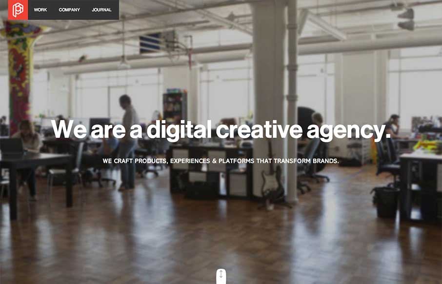
by Gene Crawford | May 21, 2013 | Design Firm, Gallery
Wonderfully worked animations as you scroll down the home page. They keep it responsive as well which is great. I like the article on how they created their new brand for Playground as well.
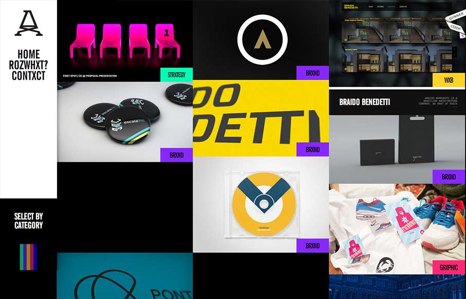
by Gene Crawford | May 17, 2013 | Gallery
Submitted by: Advan Shumiski @shumiski We are a creative studio based on Sao Paulo, Brazil. Here we think that all is about people. Design is just a tool, humans are the subject. Really interesting interactions for this website. I like how the categories sort the art...
by Gene Crawford | May 17, 2013 | BizCraft, News, Podcast
Play or Download this Episode (Recorded live on 05/09/2013) Download MP3 (51.71 MB / 00:56:29) Subscribe to the Show iTunes / RSS feed / Get Email Updates About the Show This is BizCraft, the podcast about the business side of web design, recorded live almost every...