
by Gene Crawford | Mar 30, 2015 | News
The Iron Yard is absolutely passionate about creating value for their students above and beyond what they would expect to get out of one of their 12 week programs. This is why they also create opportunities for their students to be coached in other non-technical areas...

by Gene Crawford | Mar 26, 2015 | BizCraft, Podcast
Play or Download this Episode Download MP3 (33.24 MB / 00:36:18) Subscribe to the Show iTunes / RSS feed / Get Email Updates We are now also syndicated on Stitcher. About the Show This is BizCraft, the podcast about the business side of web design, recorded live...
by Gene Crawford | Mar 12, 2015 | Gallery
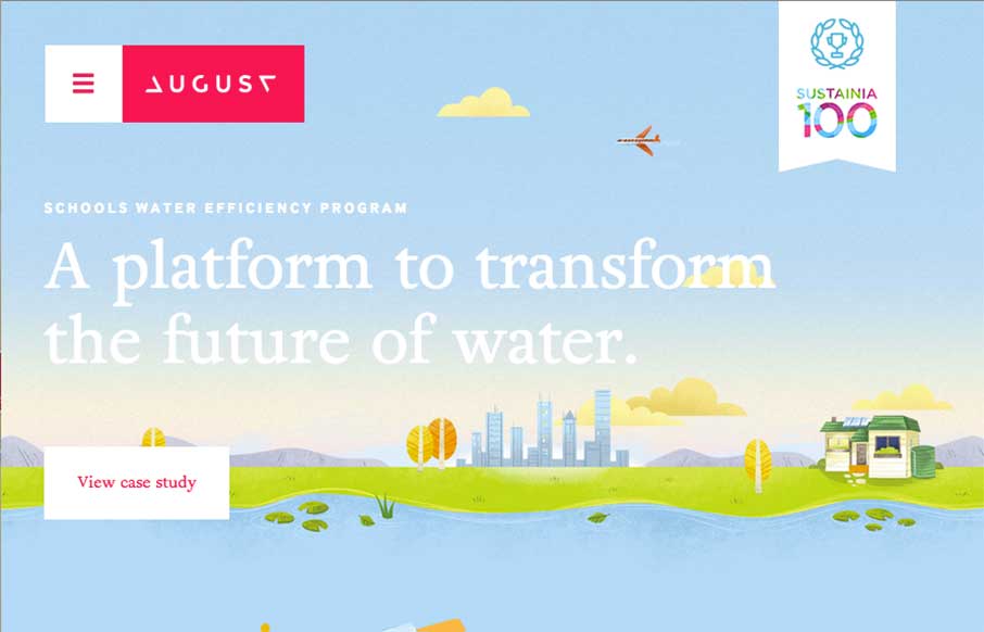
Man, what a beautifully executed design on the August website. Fun layout and some super slick illustrations and animation really drive this design home for me. The main navigation is very interesting too. It’s one of those that take over the design but I really...

by Gene Crawford | Mar 9, 2015 | Gallery
I always like to review product websites and Tapdaq is an interesting study in keeping things simple. I dig the way the graph loads the first time you visit the site. I also really like the simplicity in the overall approach to the design of the site; yet at the same...
by Gene Crawford | Mar 5, 2015 | Gallery
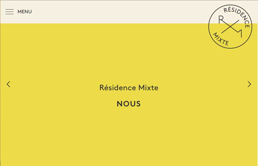
Lovely type based design for the Résidence Mixte website. I dig it in so many ways. Kind of cool how the slider actually changes the whole page – an added level of navigation. The colors are soft and also the French. 🙂