
by Gene Crawford | Jul 29, 2015 | Gallery
There is so much going on with the Fixed Group website that it just makes me smile. It’s a fairly simple look and feel but all the interaction and nav design leaves you really blown away. I really dig the main nav interactions a great deal. The colors and...
by Gene Crawford | Jul 29, 2015 | Gallery
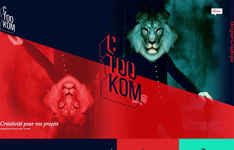
Man, this site blows me away visually. I love that logo/display type and the colors, man. I love the header and how it slides away from being a large hero area and keeps itself there in the fixed header, but still has that slight parallax slide vibe. Strong stuff....
by Gene Crawford | Jul 29, 2015 | Blog, Gallery
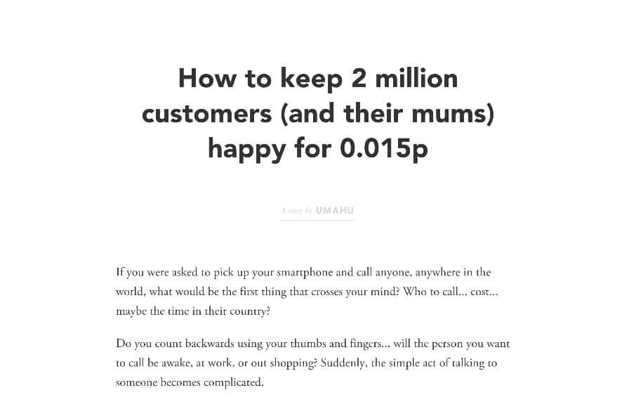
Pretty neat experience with the Umahu website. It has a very simple straightforward purpose, which is to tell a single story. This is probably the best design project you could get, since most website projects need to do about 12 things at one time to 12 different...
by Gene Crawford | Jul 28, 2015 | Gallery
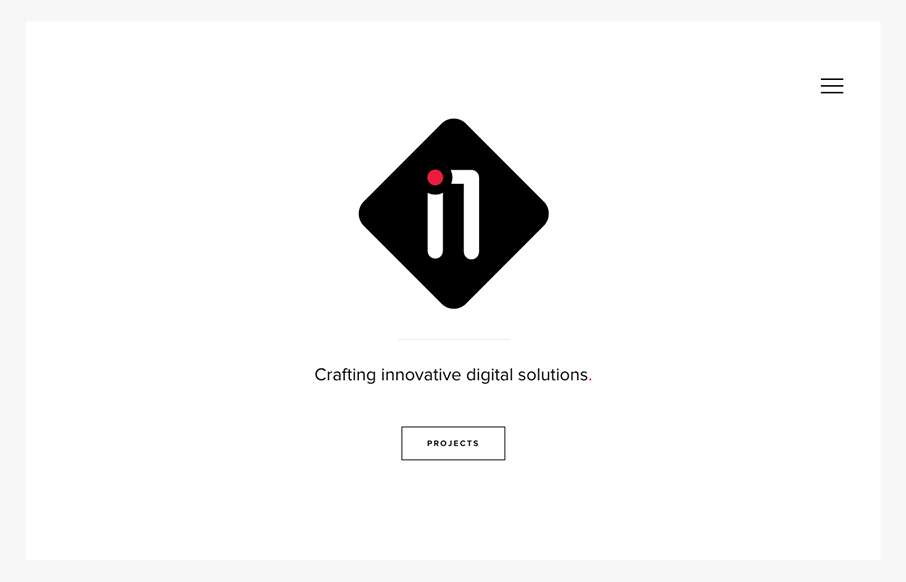
Very nice minimal approach. I’d say it’s “minimal” done right. I love that there’s a singular focus on that “projects” button, then you can explore from there, but that’s the main thing. It’s very clean and clear...
by Gene Crawford | Jul 28, 2015 | Gallery
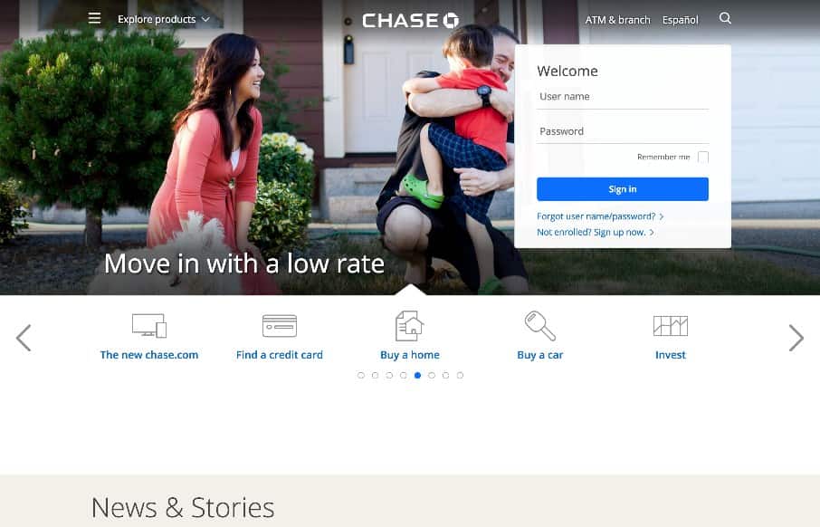
A fairly clean experience for a big credit card website. The Chase site is responsive and has some nice open space throughout that really helps with the large amount of “stuff” they’ve put on the screen. I like the navigation design, using the...