by Gene Crawford | Nov 5, 2015 | Gallery
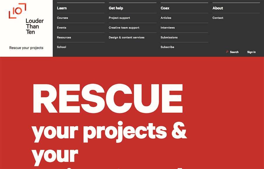
Louder than Ten, the digital home of Rachel and Travis Gertz, is a wonderfully designed approach to a digital services company website. I love the thoughtfully placed main navigation, including it’s transformation on smaller screen widths, and the large and easy...
by Gene Crawford | Nov 4, 2015 | Gallery, Marketing
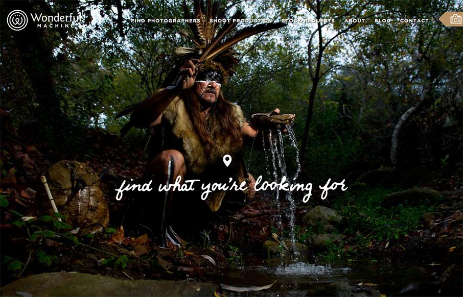
Wonderful Machine is a production company with a network of more than 700 highly curated commercial photographers worldwide. The site houses a photographer search used by agencies worldwide, and Wonderful Machine’s other services such as stock photo requests,...
by Gene Crawford | Nov 4, 2015 | Gallery
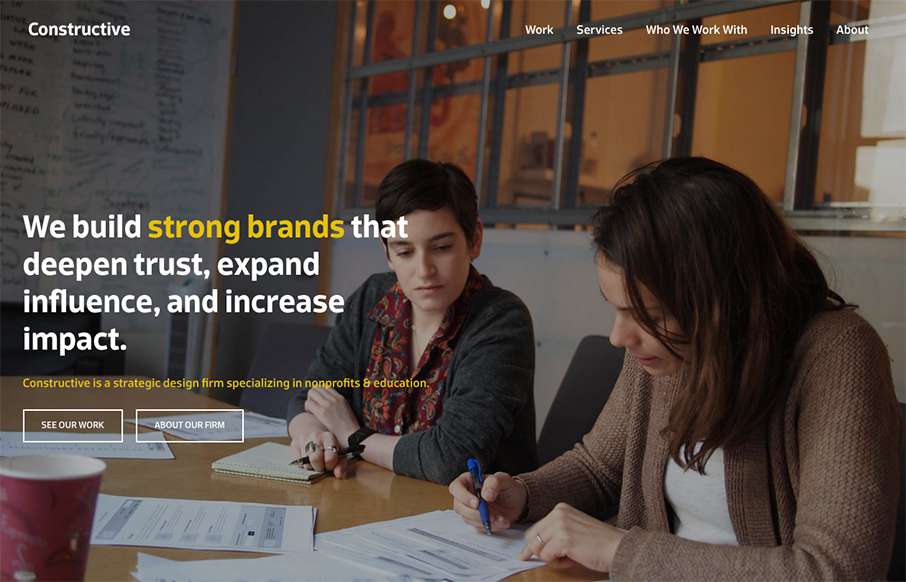
It’s a fairly standard approach to a layout but I dig it. I like the way the large splash image blends on top of the modular boxes below it. It feels fluid this way. Add in some decent responsive design and it makes for a great site.
by Gene Crawford | Oct 22, 2015 | News
The team here at ZURB is working furiously on the next version of our responsive front-end framework, Foundation for Sites 6. As we get deeper into development, we thought we’d give people a brand new tool to add to their webdev arsenal, an open-source Sass...
by Gene Crawford | Oct 20, 2015 | News
A few months ago, our CEO Peter Barth gave a “fireside chat” at a Southern Series Startup event, hosted by Launch TN, The Iron Yard and Converge SE. During the talk, Peter gave attendees a behind-the-scenes peek at his approach to successfully growing a business. Many...