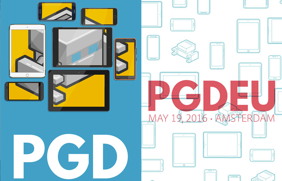
by Gene Crawford | Jan 25, 2016 | Conference, Gallery
Really solid yet simple conference website layout. I really like the big header area with the mobile device illustrations that scroll through/over the PG logo. Then I notice that the entire page scrolls over the logo. Neato! There’s clearly some love and care...
by Gene Crawford | Jan 21, 2016 | Gallery
Pretty cool background going on for the GID website. I also really like the interactions on the project images too. There’s definitely a non-standard approach to the design of this site and it’s what makes it memorable to me.
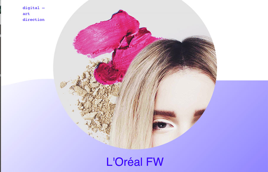
by Gene Crawford | Jan 20, 2016 | Gallery
I’m not sure about the service but the design is pretty legit. I like that it’s largely text based in the layout and there are some nifty design details as a result. The slight parallax on the text and image is quite nice and well placed. I also really dig...
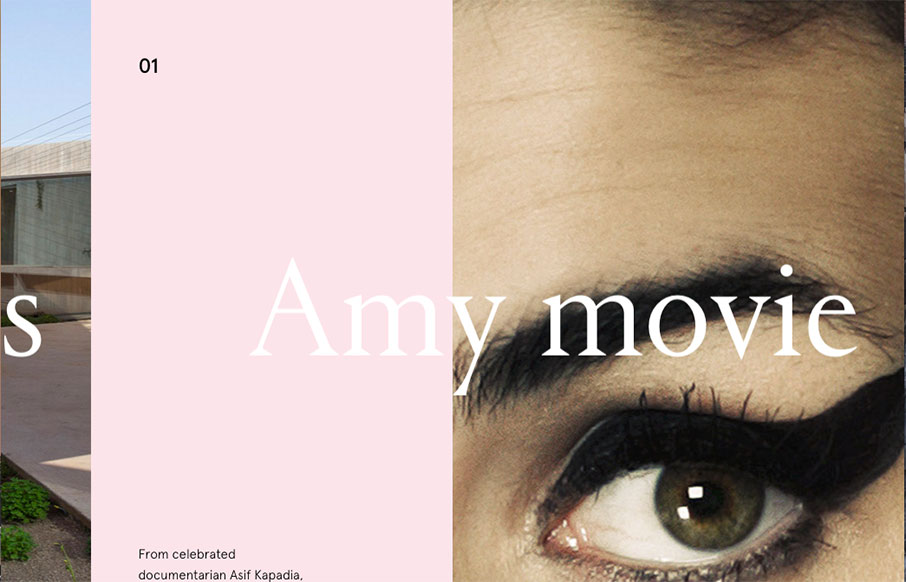
by Gene Crawford | Jan 20, 2016 | Design Firm, Gallery
This website for the VO2 Group is pretty powerful in it’s imagery and overall interactions. It harkens me back to the days of flash sites pretty hardcore, but I still love it. The interplay from the home page to the longer scrolling project pages are pretty...
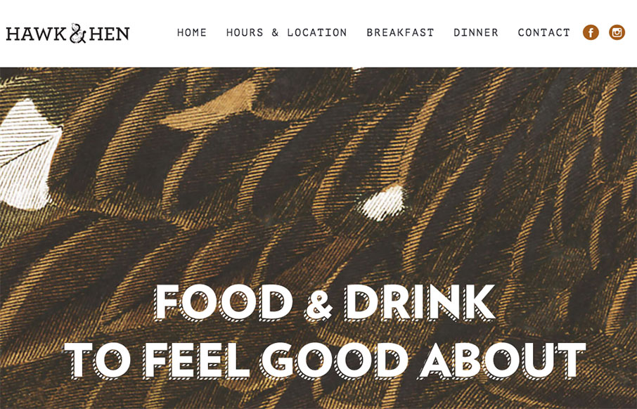
by Gene Crawford | Jan 19, 2016 | Food and Beverage, Gallery
Pretty cool website for this restaurant. I dig the name and branding too. Pretty straight forward but very openly usable by people. Love it.