
by Gene Crawford | Feb 29, 2016 | Gallery, Nonprofit
Very simple color palette, and good typography from the TSE Foundation out of Hong Kong. I first saw it in a smaller screen – but it really opens up on a desktop and looks great, because it’s simple.
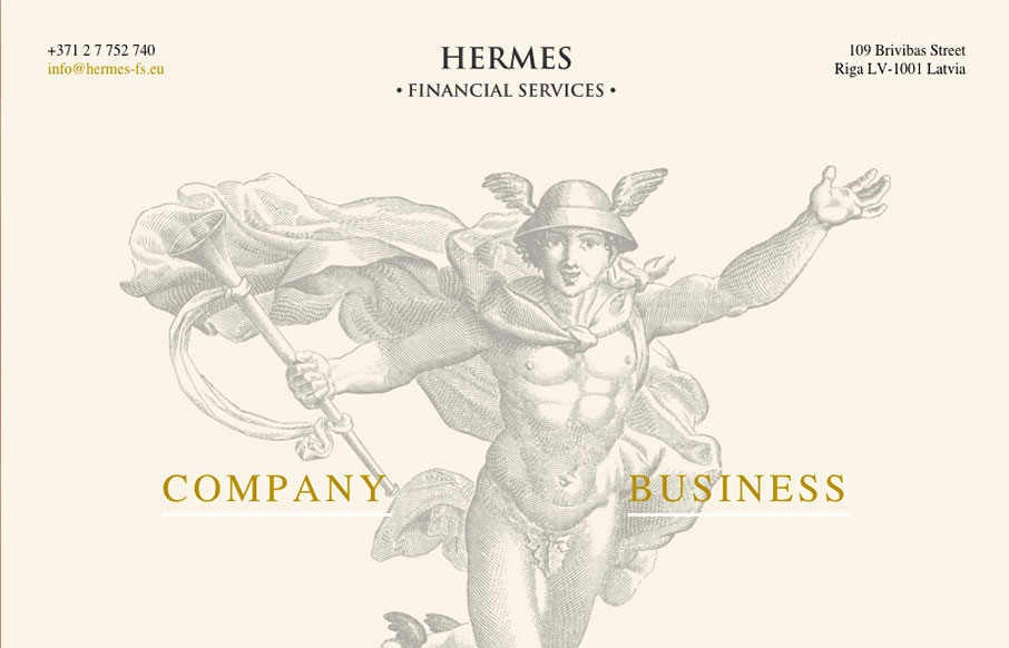
by Gene Crawford | Feb 29, 2016 | Gallery
This Latvian site for Hermes Financial Services is extremely minimal… but we like it because of that. Very simple and to the point, but also has a good look to the site – from the Hermes illustration, to the coloring and fonts.
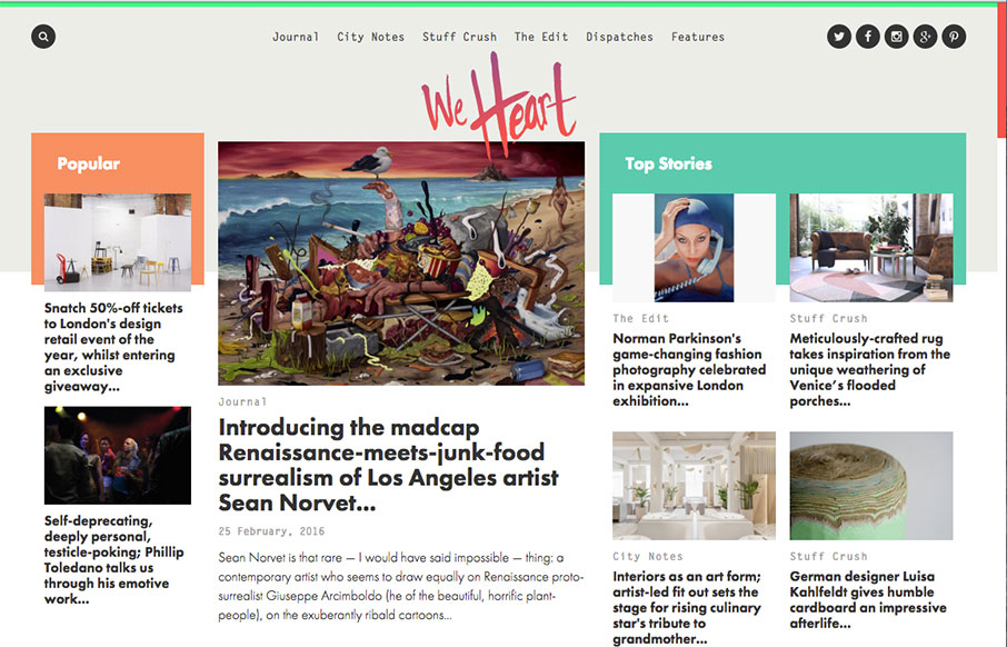
by Gene Crawford | Feb 25, 2016 | Gallery
This digital magazine / newspaper from We Heart out of Barcelona and London is pretty sweet. It’s a great example of our “old timey” blogs have evolved into robust and exciting centers of knowledge – and with so much content, I think...

by Gene Crawford | Feb 25, 2016 | Gallery, Sports/Recreation
32 Legends – 1 G.O.A.T – I’m sitting here listening to The Script’s Hall of Fame (featuring will.i.am), one of my son’s favorite songs right now – voting on my favorite NBA players of all time – it’s a good morning. And...
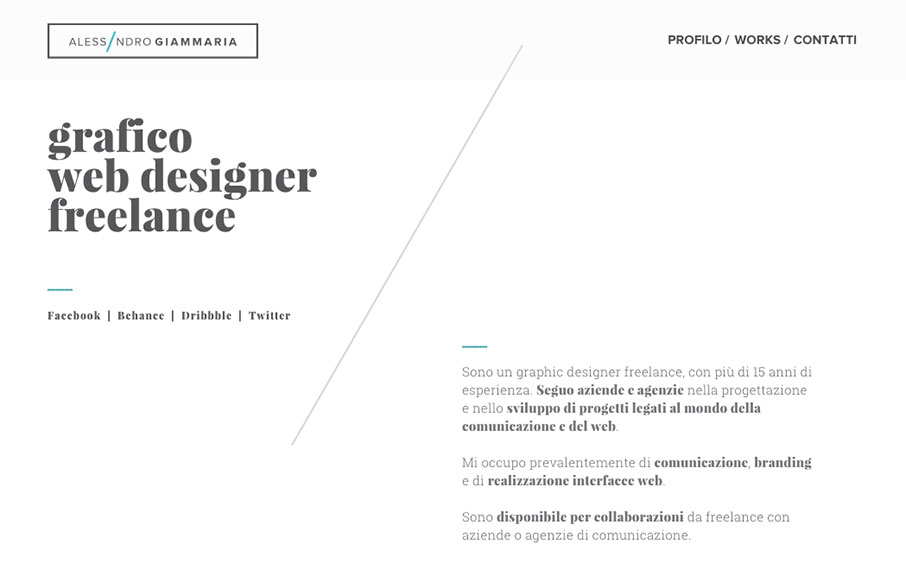
by Gene Crawford | Feb 11, 2016 | Gallery, Portfolio
Beautiful grid based design, you can feel it as you review it. The diagonal lines really drive home the grid and balance your eye movement beautifully. Love this site. From the Designer: I want to submit my new portfolio web site. I work hard to design this new...