by Gene Crawford | Mar 9, 2016 | Gallery
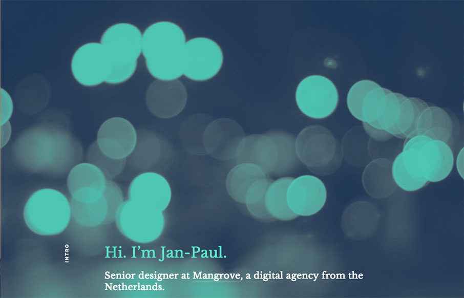
Pretty read animation/interactions as you scroll down the page. If you can get over the scroll hijacking here you’ll dig it. The colors are spot on and the overall feel/vibe is very welcoming and soothing.
by Gene Crawford | Mar 9, 2016 | Gallery
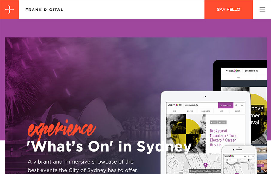
Really good vertical rhythm for the Frank Digital site. I love the top section and how it feeds into the second, third and footer areas. That blog/news section is very nice as well. I love the asymmetry to it all, but at the same time it all comes off quite...

by Gene Crawford | Mar 9, 2016 | Design Firm, Gallery
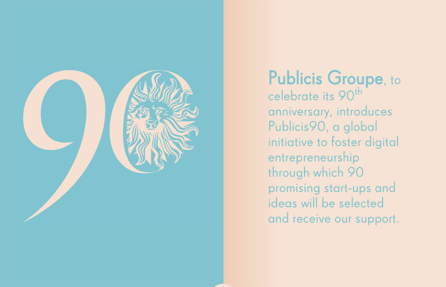
Kind of a parallax type approach, but really just targeted scrolling with some really badass inter-section animations. I love those section transitions. Solid.
by Gene Crawford | Mar 8, 2016 | Gallery, Portfolio
Really simple approach but very effective. I dig the simple links and the way all the sections are tied together with simple colors and then interactions. Straight forward works for me!

by Gene Crawford | Mar 8, 2016 | Food and Beverage, Gallery
I’m in love with the way this website does sectional targeting. You start off with sort of a splash page (we can discuss that later) then get siphoned off into a couple different directions depending on your food choices. Then there’s a solid landing page...