
by Gene Crawford | Jul 19, 2016 | Gallery
I really like the use of the product imagery and the typography. Super cool look and feel. There’s a good bit going on visually here, including the changes to the design as you scale down the window to fit smaller screens. Solid work here. From the Designer:...

by Gene Crawford | Jul 18, 2016 | Design Firm, Gallery
Cool interaction as you scroll the page. The way it moves from top to bottom is fresh. I also like the offset copy placement. Good looking design here.

by Gene Crawford | Jul 18, 2016 | Gallery, Portfolio
Pretty cool custom personal site. I dig the black and white and the three column basic approach. Very cool and simple.

by Gene Crawford | Jul 18, 2016 | Gallery
I love, love, love this layout. I love the way the images load and the way they are spaced, etc… brilliant site design harbr!
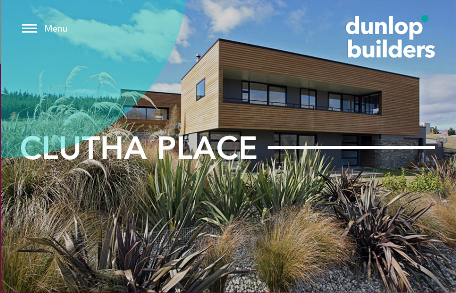
by Gene Crawford | Jul 15, 2016 | Design Firm, Gallery
Beautiful photos for dunlop builders. I really like that hamburger nav and placement, especially with the blue circle that helps draw your eye to it. Then when you click it it enlarges, pretty cool.