
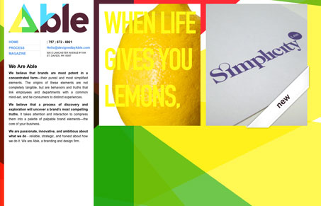
This site goes against every convention on building websites that I adhere too, but I don’t care I love it. I actually like the horizontal scrolling, I really love that the logo is see-through too. The “here’s to optimism” section on this site made me smile. Overall this website reminds me of some of the things that were going on many years ago on the web, feels very experiential even though a lot of what’s here is really rather simplistic.


Fitts’s Law: Why the Easy Button Wins
Large, close targets are faster to hit than small, distant ones, that’s Fitts’s Law. A look at the 1954 rule behind buttons, prime and magic pixels, thumb zones, and dark patterns.


We love our site. The guys over at SquaredEye.com did a terrific job!
Thanks for the list.