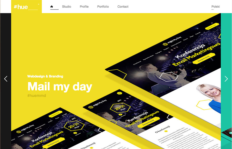
Pretty cool visual vibe with this design. I like the oversized spaces and blocks of color and even the angled screen shots – they all give it a dynamic feel even though the overall execution is fairly simple and straight forward. Bold colors and typography also lend itself to making this website feel strong.


The Call to Action, Revisited
The Call to Action hasn’t changed in a decade, but the bar has. A fresh look at prominence, copy, mobile tap targets, and accessibility, with lessons from three major design systems.


0 Comments