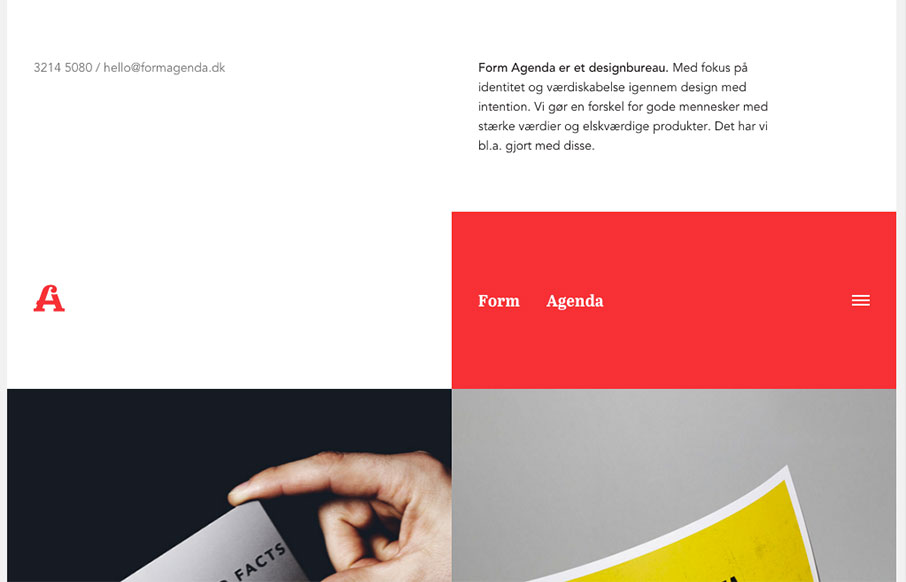
Super non-traditional looking layout for the Form Agenda website. It does everything right IMHO. I like the contact info in the top left – instead of a logo. Very clever. Then the rest of the grid is very active and keeps it fresh feeling as you scroll down the page. Bravo.
Glassmorphism: The Transparent Design Trend That Refuses to Fade
Glassmorphism brings transparency, depth, and light back into modern UI. Learn how this “frosted glass” design trend enhances hierarchy, focus, and atmosphere, plus how to implement it in CSS responsibly.


0 Comments