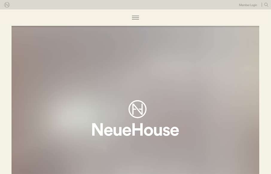
I think I’ve spent about longer looking at this site for NeueHouse then I normally do for reviews. The site is extremely well put together – love the secondary nav at the top and bottom, as well as the movement overall on the site. The work on the NeueJournal part of the site is pretty sweet too.
Glassmorphism: The Transparent Design Trend That Refuses to Fade
Glassmorphism brings transparency, depth, and light back into modern UI. Learn how this “frosted glass” design trend enhances hierarchy, focus, and atmosphere, plus how to implement it in CSS responsibly.


0 Comments