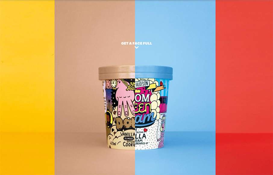
Never too early in the morning to think about ice cream… mmmm… ice cream… Homer Hudson’s site out of Oz is bright and different. Looks like one page with a few modals – compact, with all emphasis on the product. It’s a little bit of UX risk with the scroll left / right in order to see the different products, but the effect is really cool.


The Call to Action, Revisited
The Call to Action hasn’t changed in a decade, but the bar has. A fresh look at prominence, copy, mobile tap targets, and accessibility, with lessons from three major design systems.


0 Comments