Durkan Group

Durkan Group

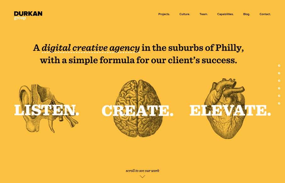
I like how they homepage is like a big splash page, but instead of being just a hero image and some useless “welcome” copy, they’ve incorporated direct links and images to their case studies. What I don’t like is how that’s echoed in the “projects” section which is the first link in the header nav, but I get it for subpages. I like how the nav is all streamlined across this website and you don’t really even need that main header nav to get to what they want you to see.


@DurkanGroup

I like how they homepage is like a big splash page, but instead of being just a hero image and some useless “welcome” copy, they’ve incorporated direct links and images to their case studies. What I don’t like is how that’s echoed in the “projects” section which is the first link in the header nav, but I get it for subpages. I like how the nav is all streamlined across this website and you don’t really even need that main header nav to get to what they want you to see.

@DurkanGroup

Kinsta

0 Comments

Submit a Comment

Your email address will not be published. Required fields are marked *

Time limit exceeded. Please complete the captcha once again.

News & Articles

The Call to Action, Revisited

The Call to Action, Revisited

The Call to Action hasn’t changed in a decade, but the bar has. A fresh look at prominence, copy, mobile tap targets, and accessibility, with lessons from three major design systems.

