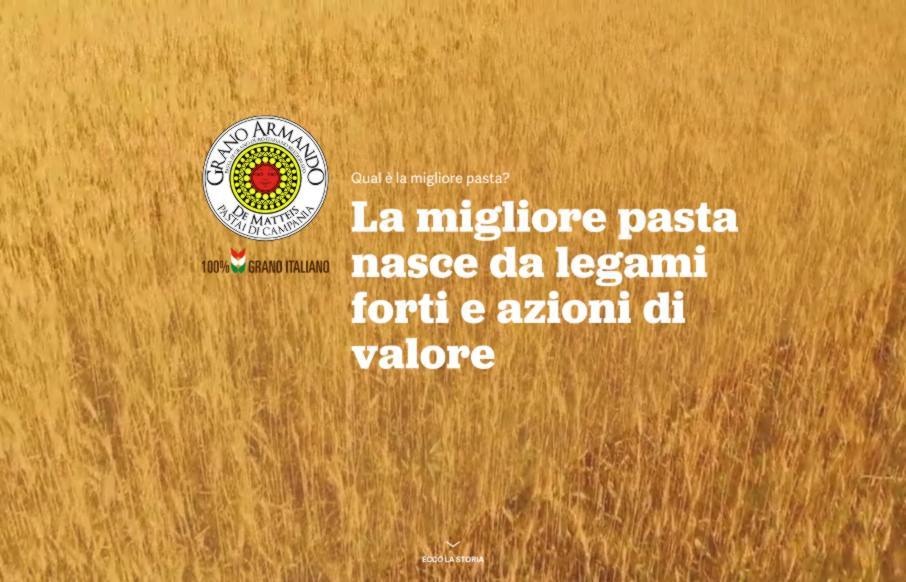
Man! I love the illustrations on this website. I can stare at them all day! They are well done and the animations that load them up as you scroll down the page for the first time are very well timed. The colors and style all work so well with the content too. Lovely, lovely site design.
From the Designer: “The aim of the website is to drive traffic towards to the official website of an Italian pasta brand whose name is Grano Armando. Users looking for information on the search engines about which is the best pasta brand, will run into www.migliorepasta.it (that can be translated into English as www. bestpasta .it).
With an engaging mix made by effective copy and a stylish design, the website describes all the pros that make Grano Armando an excellent pasta, focused not only on special taste but also on secondary elements, such as the consideration of the Italian wheat farmers, the complete control over the whole supply chain and finally the importance of adopting policies based on environmental and economical sustainability.
Every main strength has a specific call-to-action that invites users to share on Facebook and Twitter the piece of information they’ve learned.”
Submitted by: Roll Studio
Twitter:
Role: Designer
Designer URL: http://www.rollstudio.co.uk/
@granoarmando


0 Comments