
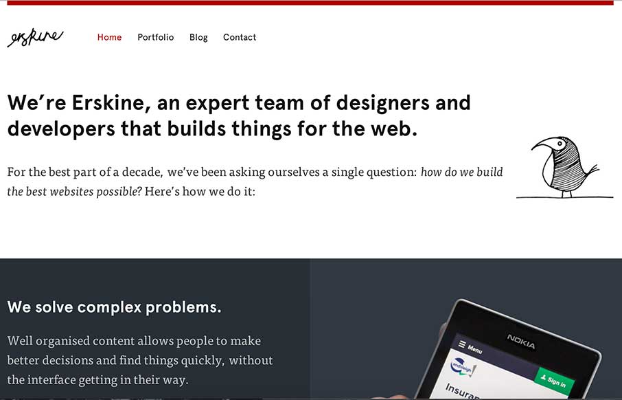
Sometimes you just need a design that simply states who you are, and is devoid of bells and whistles that may complicate your message. Erskine Design out of Dallas, TX, has done that – clear layout, decent font combinations (serif, sans, and script) – a little illustration – a little portfolio – and voila – good website. I also like how they address accessibility (see footer) – which probably leads to the design decisions above.


Fitts’s Law: Why the Easy Button Wins
Large, close targets are faster to hit than small, distant ones, that’s Fitts’s Law. A look at the 1954 rule behind buttons, prime and magic pixels, thumb zones, and dark patterns.


0 Comments