Squid Compression

http://squidcompression.com/

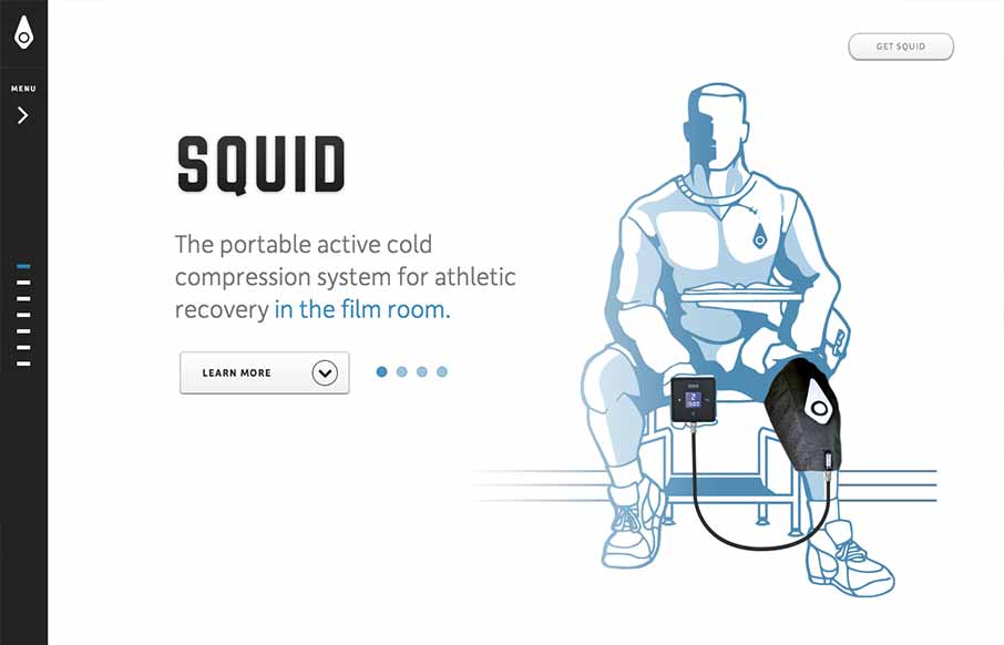
I like a simple approach, the Squid website does just that. Basically working much like a keynote/powerpoint slideshow – which is really all it needs to do in this instance. The navigation works pretty well, with the down arrow at the bottom and the different highlighted “dots” for when you’re on a specific section. Slide the nav more open and they have labels for the sections. Beautiful illustrations and renderings of the product too make the page really come to life.

0 Comments

Submit a Comment

Your email address will not be published. Required fields are marked *

News & Articles

Website Scanning Patterns for Maximum Engagement

Website Scanning Patterns for Maximum Engagement

Discover how users visually process websites, the role of scanning patterns, content placement, and “the fold” Learn to design engaging pages with fast-to-consume content that aligns with user behavior.

Why Are Wireframes in Web Design So Important?

Why Are Wireframes in Web Design So Important?

Wireframes are the blueprint of web design, aligning goals, improving UX, and saving time. Discover why these visual structures are essential for creating intuitive, user-focused, and efficient websites.

Sign-Up: Enhancing Conversions through good UX

Sign-Up: Enhancing Conversions through good UX

Optimize your website’s sign-up process by focusing on clarity, ease, and user mindset. Clearly explain the purpose, benefits, and steps, and use social proof to build trust and drive conversions.