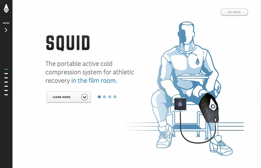
I like a simple approach, the Squid website does just that. Basically working much like a keynote/powerpoint slideshow – which is really all it needs to do in this instance. The navigation works pretty well, with the down arrow at the bottom and the different highlighted “dots” for when you’re on a specific section. Slide the nav more open and they have labels for the sections. Beautiful illustrations and renderings of the product too make the page really come to life.
Looking Fast: The Art of Website Speed Perception
In the web world, technical speed and user perception matter. By improving design for a faster appearance, you boost conversions and stand out online. Speed isn’t just loading time; it’s perception.


0 Comments