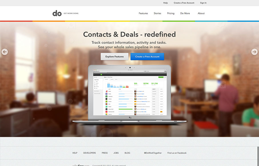
I really love the simplicity of the Do site design. It’s boiled down to just what’s needed. The overall palette is muted, but not really which is a clever understatement to work into the design. I also dig the Features page, I like how it goes from just showing a little then tapers wide to have a ton of content in a big grid like layout. Really great minimal without being minimal design (if that makes sense…)


Glassmorphism: The Transparent Design Trend That Refuses to Fade
Glassmorphism brings transparency, depth, and light back into modern UI. Learn how this “frosted glass” design trend enhances hierarchy, focus, and atmosphere, plus how to implement it in CSS responsibly.


0 Comments