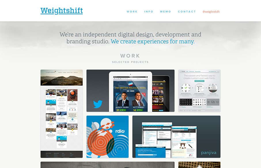
Superb responsive design decisions made on this newest version of Weightshift’s site. Making the portfolio images get smaller and more button like for the iPad and iPhone screen widths is brilliant. I also think the focus on the selective nav elements as you get smaller in screen width works great too. Going down to “work, info & memo” makes it so well focused and clear. Love this website!


The Call to Action, Revisited
The Call to Action hasn’t changed in a decade, but the bar has. A fresh look at prominence, copy, mobile tap targets, and accessibility, with lessons from three major design systems.


Nice effect and work.
Thumb up!!!