
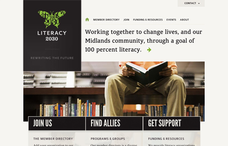
The home page on this site is really striking. Type, color, and imagery are bold and attracting and the layout does a nice job leading you through. I like the simplicity of the three calls to action. They’re succinct, but still provide necessary info. At first I didn’t notice they had images in the background. I’m not sure they’re really needed. I think the only slightly disappointing thing is that the impact of imagery from the home page isn’t carried through a bit more on the internal pages. It does however give a feeling of the cover and pages of a book. Whether or not that was intentional, for me, it’s a nice subconscious tie in.


Fitts’s Law: Why the Easy Button Wins
Large, close targets are faster to hit than small, distant ones, that’s Fitts’s Law. A look at the 1954 rule behind buttons, prime and magic pixels, thumb zones, and dark patterns.


0 Comments