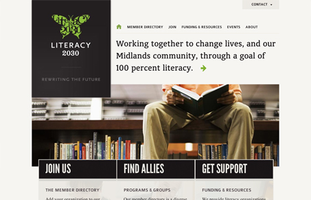
The home page on this site is really striking. Type, color, and imagery are bold and attracting and the layout does a nice job leading you through. I like the simplicity of the three calls to action. They’re succinct, but still provide necessary info. At first I didn’t notice they had images in the background. I’m not sure they’re really needed. I think the only slightly disappointing thing is that the impact of imagery from the home page isn’t carried through a bit more on the internal pages. It does however give a feeling of the cover and pages of a book. Whether or not that was intentional, for me, it’s a nice subconscious tie in.

Looking Fast: The Art of Website Speed Perception
In the web world, technical speed and user perception matter. By improving design for a faster appearance, you boost conversions and stand out online. Speed isn’t just loading time; it’s perception.


0 Comments