
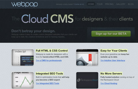
Really nice mood created by the dark textures and colors set on the main headline type. The call to action is super clean and clear. The pricing & plans page is also quite nicely done both visually and from a sales perspective. I also like the “tour” section, it’s not just pop up windows, it’s full pages with a clean clear navigation design.




0 Comments