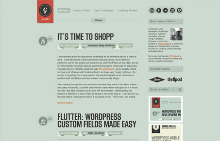
NIce blog design that takes on the traditional 2 column design and gives it depth and detail. I like the background texture and the small overlapping and 3D like details. It’s subtle and doesn’t hit you over the head but the design has a nice sense of craftsmanship. My favorite part of this design is how it’s largely monochromatic but for the logo and images pulled in from Dribbble, they just scream out for you to look their way as you scroll around on the site.


0 Comments