
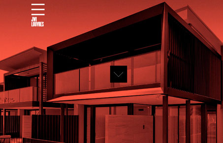
I really like the look and feel of this website, it’s very clean and grid-like, everything I expect in a solid architect firm website. I think the experience is intriguing, if you can get past the loader, the stark red and black image with the arrow that slings you into the site proper is neat. I’m not wild about the interaction on the main navigation area sliding open and closed like that, but somehow it feels like it fits into the site okay. What do you guys think?




0 Comments