jwilouvres.com.au

jwilouvrescomau

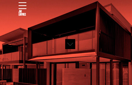
I really like the look and feel of this website, it’s very clean and grid-like, everything I expect in a solid architect firm website. I think the experience is intriguing, if you can get past the loader, the stark red and black image with the arrow that slings you into the site proper is neat. I’m not wild about the interaction on the main navigation area sliding open and closed like that, but somehow it feels like it fits into the site okay. What do you guys think?

0 Comments

Submit a Comment

Your email address will not be published. Required fields are marked *

News & Articles

Looking Fast: The Art of Website Speed Perception

Looking Fast: The Art of Website Speed Perception

In the web world, technical speed and user perception matter. By improving design for a faster appearance, you boost conversions and stand out online. Speed isn’t just loading time; it’s perception.

Designing for Errors: Creating User-Friendly Contingency Plans

Designing for Errors: Creating User-Friendly Contingency Plans

Contingency Design hinges on empathy, understanding user frustration, and transforming errors into positive impressions. By embracing these principles, you enhance user experiences, retain customers, and boost revenue in the competitive digital landscap