by Gene Crawford | Apr 17, 2014 | Gallery
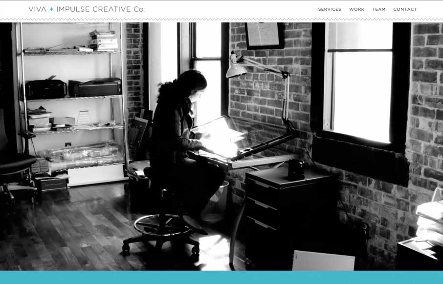
Here’s a similar visual formula for a layout but there’s a slight difference to this site with the light line work and icon designs. I dig it.
by Aaron Griswold | Apr 15, 2014 | Gallery
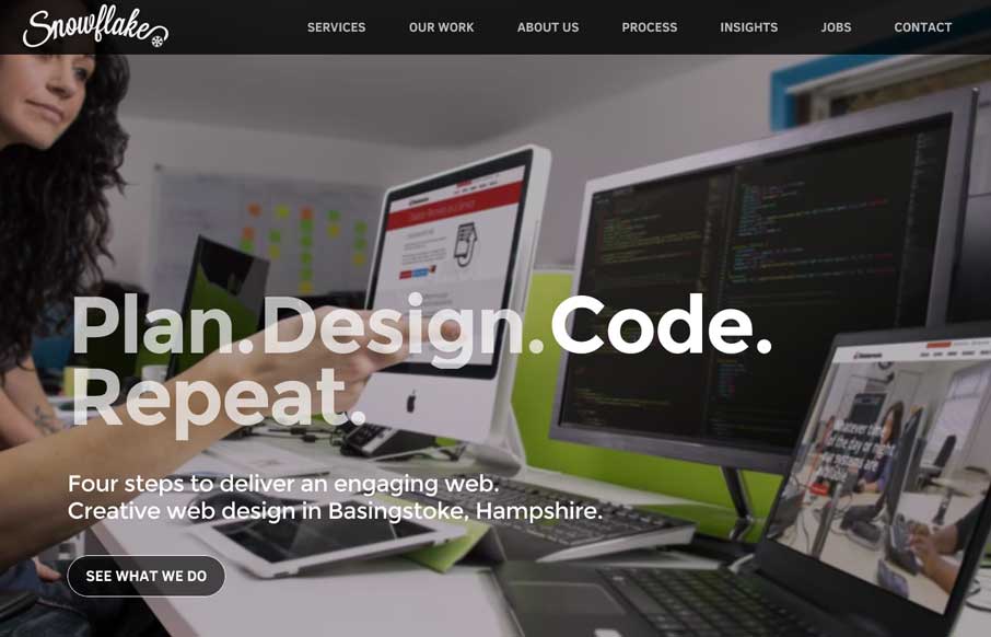
Oooh! I love the way the background images in the hero area(s) of this page get some faux 3d movement. That’s very smart and I don’t think i’ve seen that before. What a way to make the site different than the rest. Bravo.
by Aaron Griswold | Apr 14, 2014 | Gallery
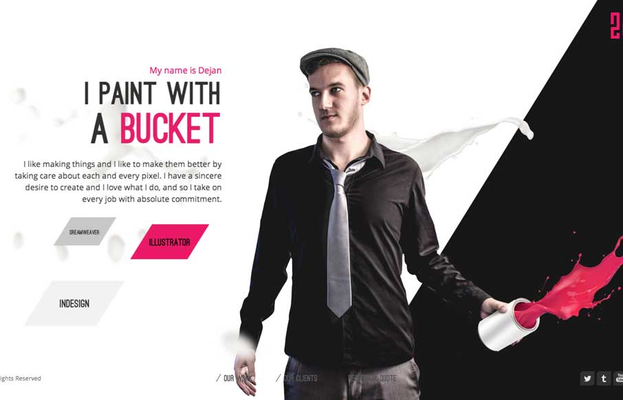
Sometimes you’re presented with something completely different, like in the case of the 2che website. When you start to scroll you go right to left and there’s a sort of horizontal parallax (which is the original direction right?) going on. It’s not...

by Gene Crawford | Apr 8, 2014 | Gallery, Medical
Strong visual language backs up a nice solid design and layout. Sometimes you can see there’s good content that the designer has to work on, this site is a good example of that. Good content backed up with good design.
by Gene Crawford | Apr 4, 2014 | Gallery
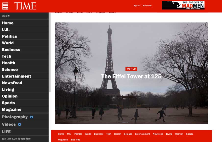
Really great transition to a responsive website from Time Magazine. It’s really beautifully done. There are also sections like this World Trade Center article that show they are really trying to push the boundaries of online writing. Well done.
