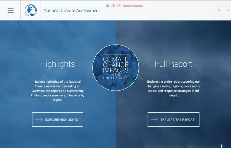
by Gene Crawford | May 23, 2014 | Gallery, Government, Nonprofit
Aside from being scared now. The National Climate Assessment website is a thing of beauty. Fully responsive and pretty dang immersive. Beautifully executed.

by Gene Crawford | May 20, 2014 | Gallery
Cool interactions and content blocking. I really dig the first time experience when you hit this site. The way the portfolio navigation on the home page is designed is very cool along with the loading animations of the 3 marquee sections.

by Aaron Griswold | May 8, 2014 | Gallery, Sports/Recreation
Cool site that keeps it simple and is a straight forward layout. Proving good photography, content and solid layout work. Also this race looks fun.

by Gene Crawford | May 1, 2014 | Gallery
Cool vibe to this site. I like using it. The use of the “hamburger” icon to show the names of the pages/sections instead of only relying on the icons is a good idea. I love the yellow and black with the B&W imagery to boot.

by Gene Crawford | May 1, 2014 | Education, Gallery
Pretty cool visual details built into this site. Like the sped up video in the hero area and all the loading animations as you scroll down. Really great visuals to boot. Winning combo design wise.