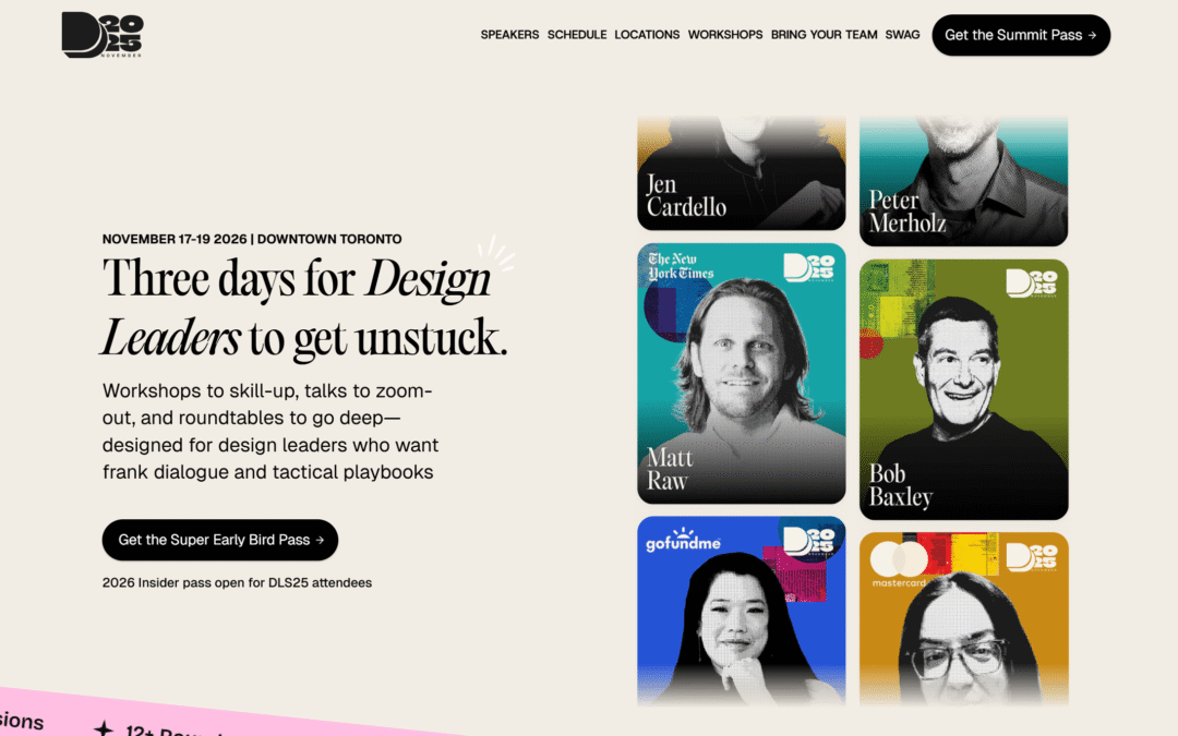
by Thomas | Feb 19, 2026 | Conference, Gallery
by Thomas | Jan 22, 2026 | Design Firm, Gallery
by Thomas | Jan 12, 2026 | Gallery, Portfolio
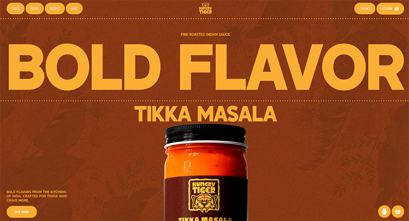
by Thomas | Dec 1, 2025 | Food and Beverage, Gallery
by Gene Crawford | Apr 30, 2024 | Design Firm, Gallery
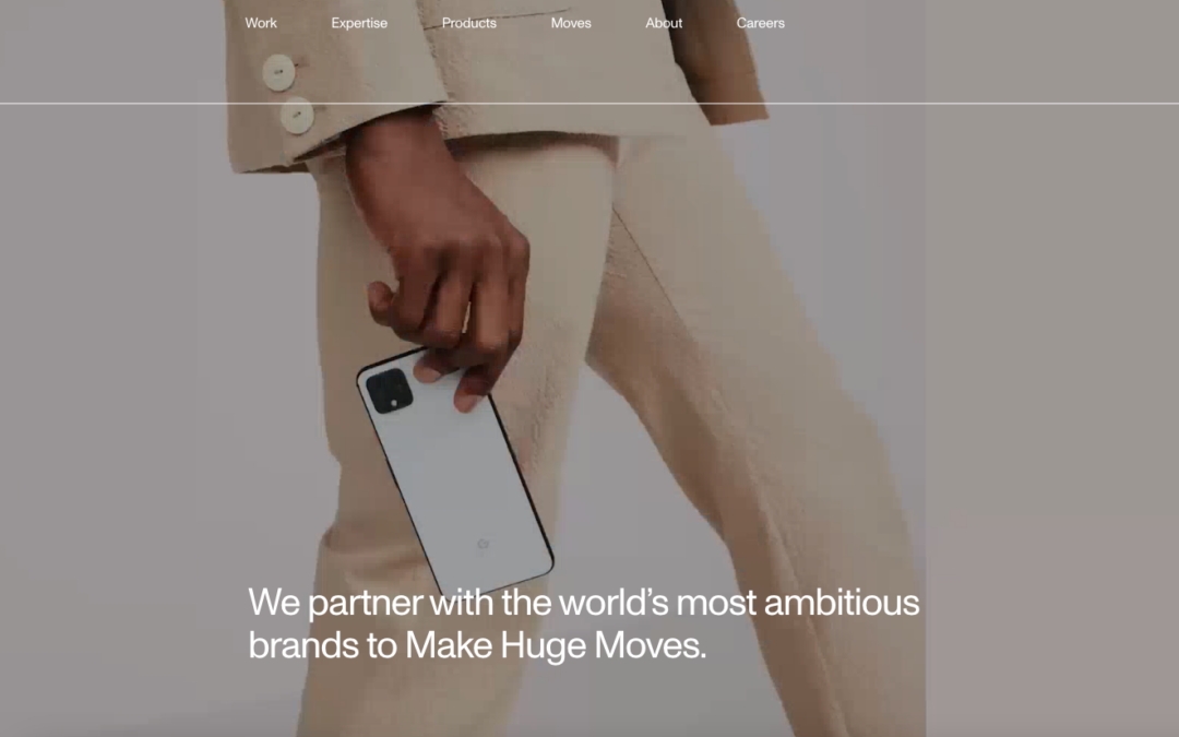
Huge has been around a long time, there’s probably at least 5 or more other submissions for this one in the gallery here. Never disappoints.