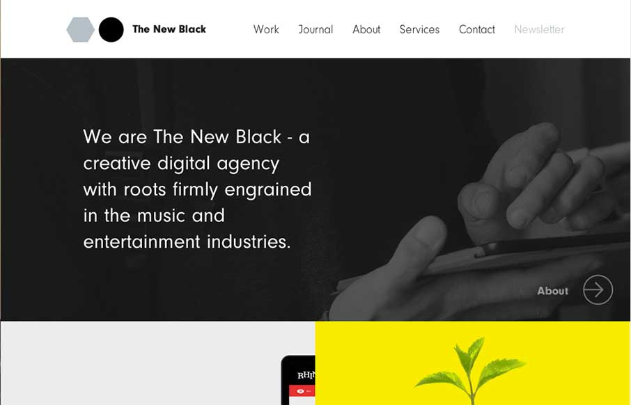
by Gene Crawford | Oct 30, 2014 | Gallery
I love the design for The New Black a lot. It’s traditional in the way it uses the horizontal header bar, but very much not so in the way it’s blocked out and uses interaction to get you involved in mousing around the page. Awesome stuff, done simply....
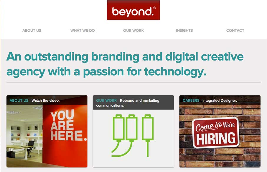
by Gene Crawford | Oct 29, 2014 | Gallery
Wonderfully simple but elegant layout. Tight spacing between elements and good vertical rhythm really makes this site feel like it was crafted with love. Also – check out the map on the contact page – same Google map – different look though.
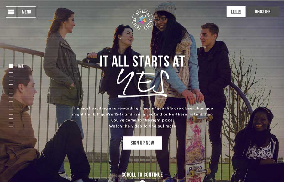
by Gene Crawford | Oct 23, 2014 | Gallery
Loose visual style and stark graphic type and colors make up a site aimed at young people to signup for service. It’s a smart design in many ways but the strongest part is it’s mobile friendly enough to get the right audience looking at it. Submitted By:...
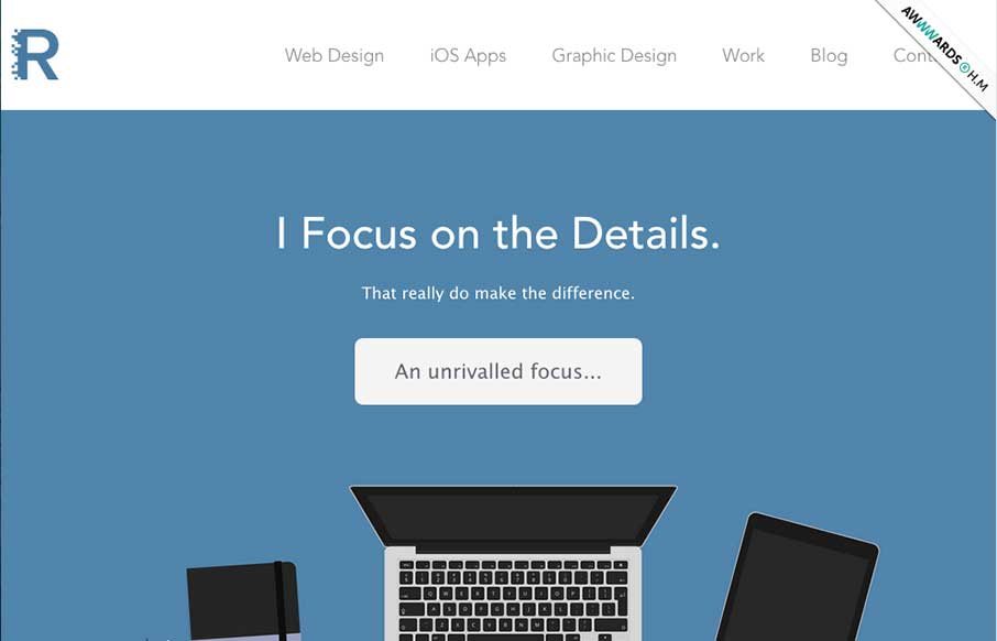
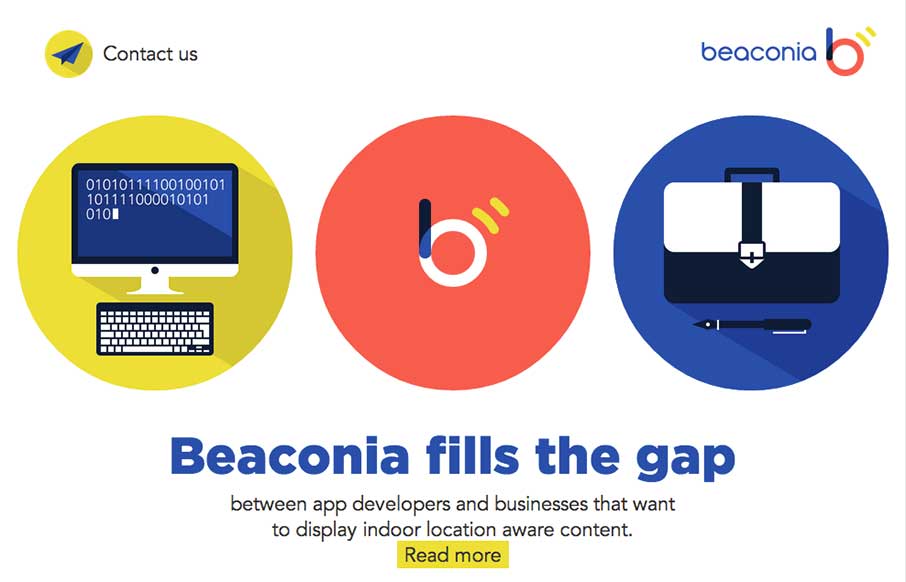
by Gene Crawford | Oct 22, 2014 | Gallery, Portfolio
Super nice illustrations to kick the page off with, then followed up with some nice detail work and good copy. Love this straight forward but thoughtful approach.
by Gene Crawford | Oct 22, 2014 | Gallery
Very slick details. I love the mix of illustration/icon work and the photos. Add in that nice little interaction with the animation and i’m thinking you’ve just grabbed people’s attention. Good work. Submitted by: Darius Krisiunas Role: Designer...