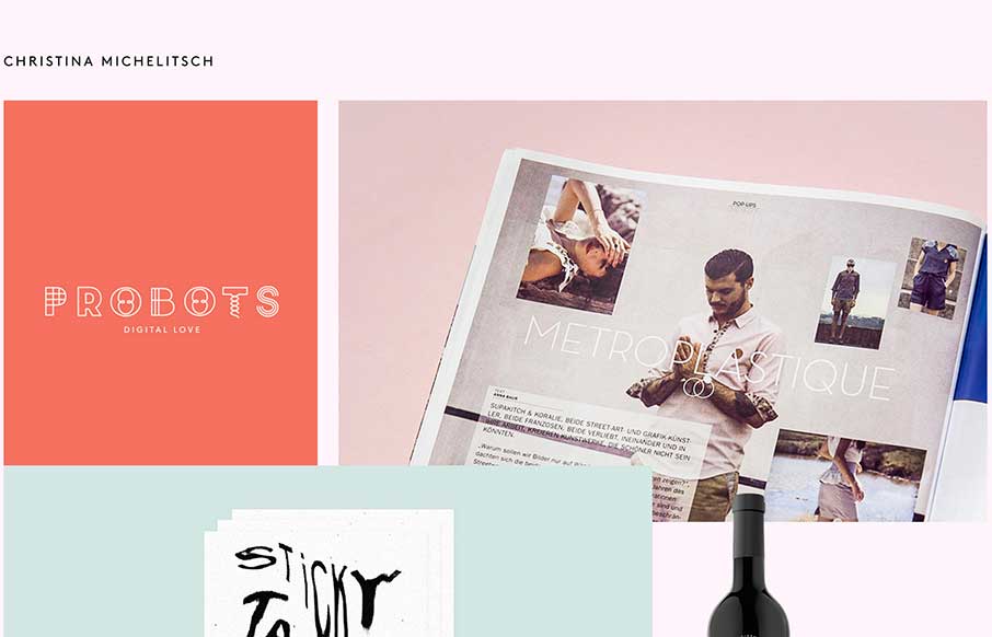
by Aaron Griswold | Oct 6, 2014 | Gallery, Portfolio
The beauty of this site is less in the home page, but more in the portfolio pages of Christina’s work. Each page has a different feel to go along with the different branding work she has done for her clients. Really like the work on Probots, and like the idea...
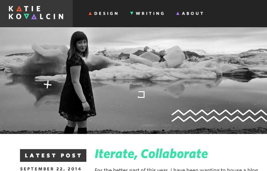
by Gene Crawford | Sep 29, 2014 | Gallery, Portfolio
I love website designs like this where the artist’s vibe comes through into the design of the page. Really fun approach and clean production at the same time. Bravo. The talented @katiekovalcin relaunches her portfolio, embracing a responsive, geometry-accented...
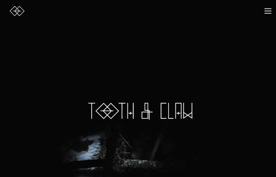
by Gene Crawford | Sep 26, 2014 | Gallery
Very ‘story telling’ centric design with Tooth & Claw. I like this aspect of it, keeping you focused on this aspect seems important for these guys. Some of the nav elements are a little hard to see and get to, but in the end i’m not so sure...
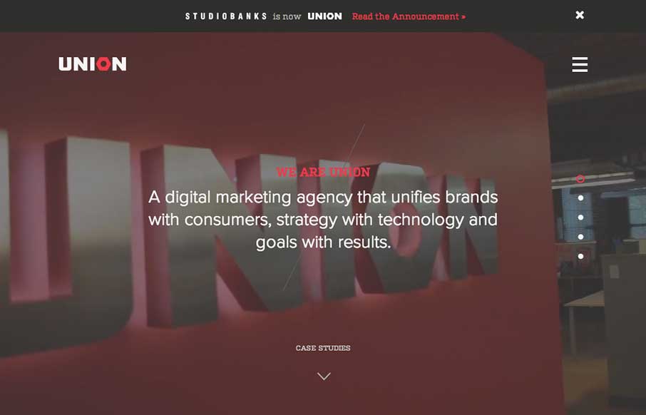
by Gene Crawford | Sep 24, 2014 | Gallery
Here’s a good example of a site pretty much hiding everything except a few links to case studies/work examples under a fly out overlay nav. I gotta assume this is by design. I do like the idea of keeping most people focused on your work like this btw.
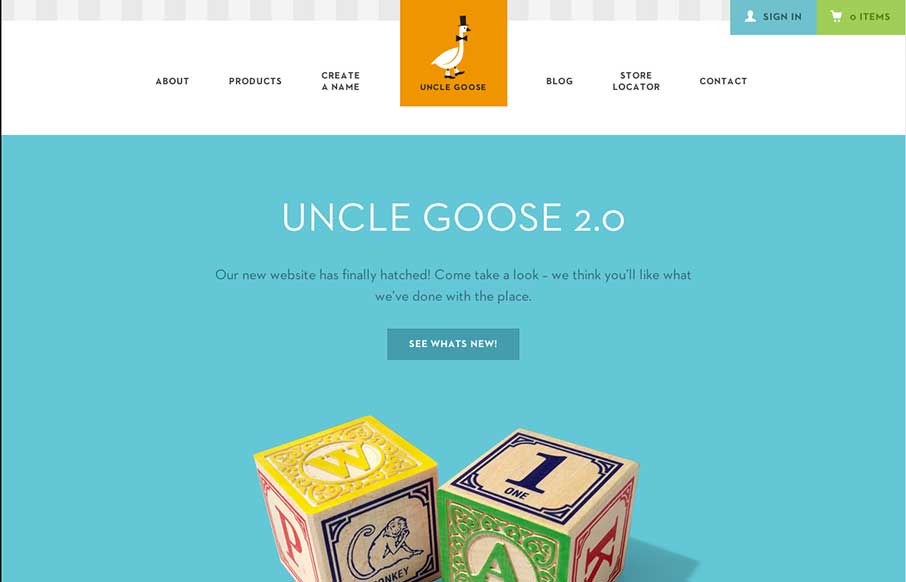
by Aaron Griswold | Sep 19, 2014 | Gallery
Old Mother Hubbard ain’t got nothin’ on Uncle Goose… I wanted to do some Andrew Dice Clay when I saw this site – but finally realized how inappropriate that might be… Now on to the site: What really sticks out is the attention to design...