by Gene Crawford | May 24, 2012 | Gallery
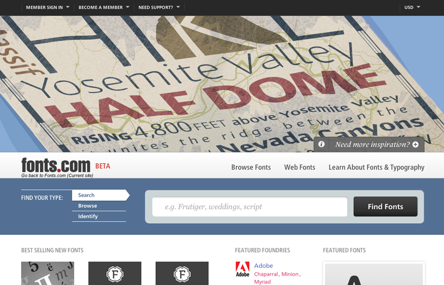
Looks as if Happy Cog just rolled out a new design for fonts.com. Here’s a super detailed blog post about it. I like a lot of this new design. My particular favorite is the main image slideshow and how the main site colors change out as you experience it. Good...

by Gene Crawford | May 23, 2012 | Gallery, Music
The new(ish) rdio.com design is beautiful. I love the visual engagement that the design drives you into as you make your way down the hierarchy of the page. From light to dark, from sparse to dense it’s very well put together. I think the colors get so much...

by Gene Crawford | May 22, 2012 | Gallery
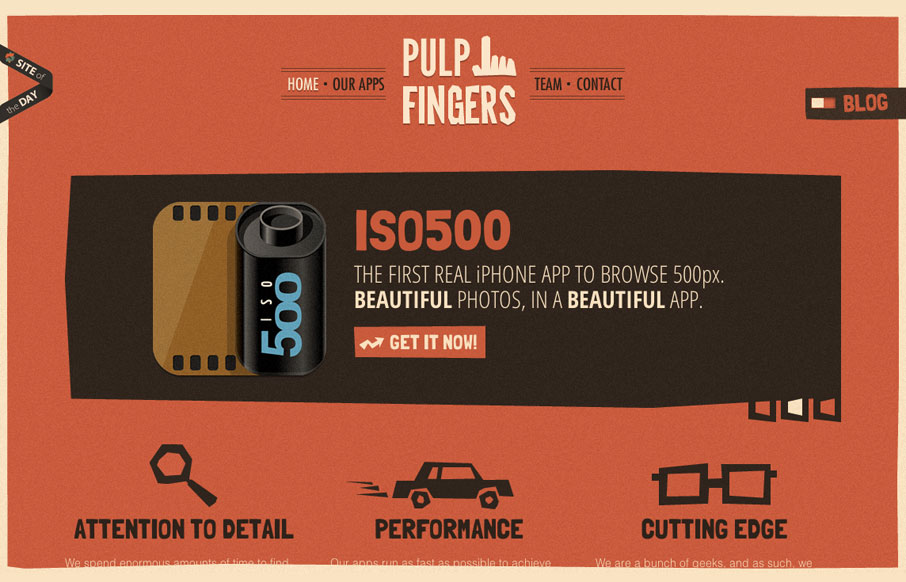
The pulpfingers.com site is simple gorgeous. I love the orange/red and brown/black coloring, it’s unique looking and along with the stark graphic illustrations gives it a nice sense of rememberability. There are some neat little visuals here and there on this...

by Gene Crawford | May 21, 2012 | Gallery
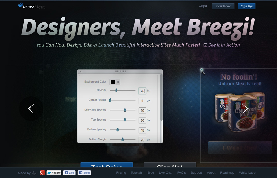
Well, we’ve been working on this product for about 1.5 years so it means to a lot to us. We spent a good deal of time on its homepage as well. We hope you like it. Submitted by: Navid Safabakhsh @breeziapp Role: Product Manager Beautifully executed website for...

by Gene Crawford | May 17, 2012 | Gallery
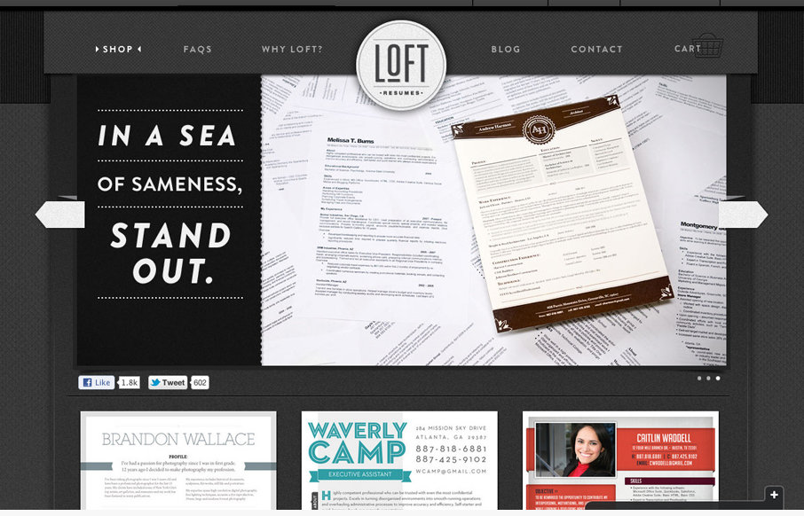
We’re trying to bring great visual design job seekers’ resumes to help them standout. It’s a document that normally doesn’t get a lot of design love. We built the site on Shopify but we’ve done some nice little customizations – some...
