by Aaron Griswold | Aug 5, 2014 | Gallery
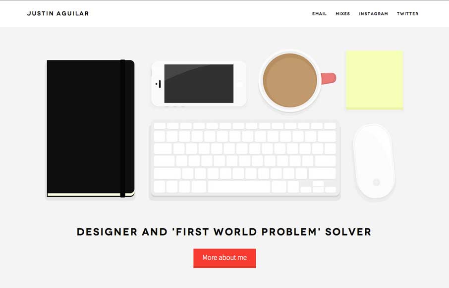
Really like Justin’s use of navigation, both in the Work section, and in the header. It’s different, active, animated, and gets away from the proverbial hamburger menu icon – which is always a good thing. The rest of the site is clean and crisp, with...

by Aaron Griswold | Aug 4, 2014 | Food and Beverage, Gallery
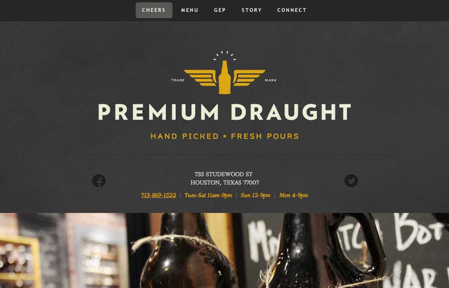
A good one page site that seems to be an extension of the growler fill station itself (making the site background / tecture look like the chalkboards in the store). In the mobile version, they’ve made the menu more accessible for your phone, without resorting to...

by Aaron Griswold | Jul 29, 2014 | Entertainment, Gallery
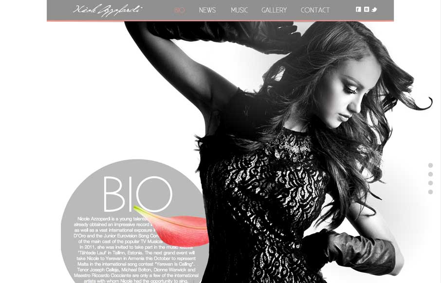
Great use of parallax with flying flower petals, bios, and a singer. Also like the use of texture in one of the sections, and then subtler parallax in another section to give some differentiation. Submitted by: Justin Sammut Role: Designer

by Gene Crawford | Jul 25, 2014 | Gallery
Just a really clean and nicely subdued site design for a designer. I like it much. Submitted by: Christopher Ware @christopherware Role: Designer & Developer

by Gene Crawford | Jul 18, 2014 | Gallery
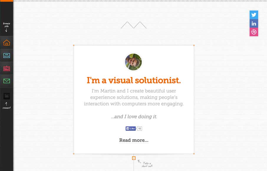
Pretty cool side bar nav design. I also really dig the way the main page is put together with the lines/graph paper feel and the trail connecting things. It’s intriguing enough to make me scroll it and check it all out.
