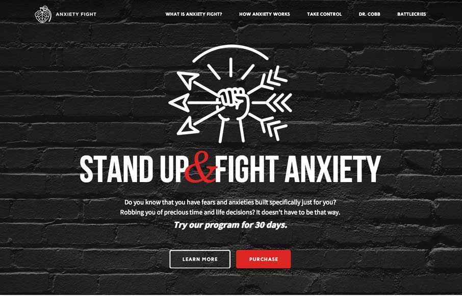
by Gene Crawford | Apr 8, 2014 | Gallery, Medical
Strong visual language backs up a nice solid design and layout. Sometimes you can see there’s good content that the designer has to work on, this site is a good example of that. Good content backed up with good design.
by Gene Crawford | Apr 7, 2014 | Gallery
Love the minimal color palette. Smooth transition between the topmost section and the main nav load too. Then plenty of little visual interaction pieces across the page as you scroll to keep things interesting. Lovely site.
by Aaron Griswold | Apr 3, 2014 | Gallery
Pretty nifty site design. I like how the main nav stays fixed but in the box shape that overlays the site. Also, resize this badboy, that’s a cool way to hide the transitions but also making it interesting for us that build sites too. Bravo.
by Gene Crawford | Mar 10, 2014 | Gallery
Engaging illustrative website. There’s also plenty of interaction stuff happening on the home page to keep you interested. The thing I like most is that it’s not intrusive at all. You can engage with it by continuing to scroll or not. The look and feel of...
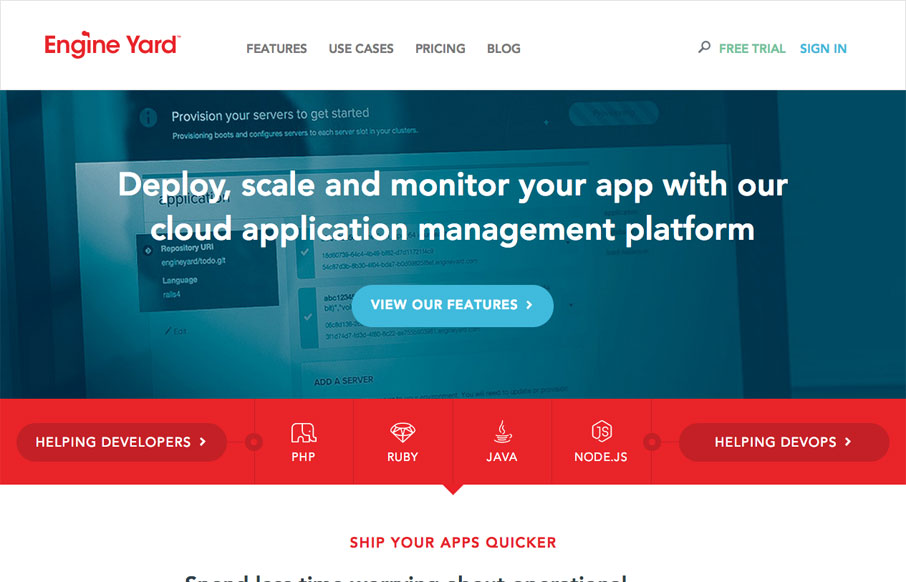
by Gene Crawford | Feb 26, 2014 | Gallery
Beautiful redesign of the Engine Yard website. What I like to read most is that they focused on the content first and dug into what people needed to get out of the website before any sort of fanciness. We also dug deep into our site and found what worked for visitors...