by Gene Crawford | Mar 9, 2016 | Gallery
Pretty read animation/interactions as you scroll down the page. If you can get over the scroll hijacking here you’ll dig it. The colors are spot on and the overall feel/vibe is very welcoming and soothing.

by Aaron Griswold | Feb 17, 2016 | Gallery
Nice minimal site from Herdl out of the UK. Minimal because they hit you with headlines on the front page, instead of a lot of words (that your potential client never reads anyway… no… really). There’s meat in the Services pages – but the home...

by Gene Crawford | Feb 10, 2016 | Gallery
Pretty neat approach with the 8th Sphere website. No real images of anything, just line graphics and a dark background with white text. You don’t see that often anymore. I dig this approach. I like the main graphic a great deal, the process/machine one. Pretty...
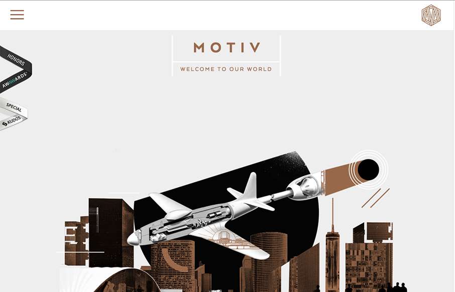
by Gene Crawford | Dec 10, 2015 | Gallery
Sometimes architect’s websites can be crazy and very “flash” like. Remember that? I’m still seeing things like that, particularly in this industry for some reason… The Motive site skirts the line with the page loader on each section and...
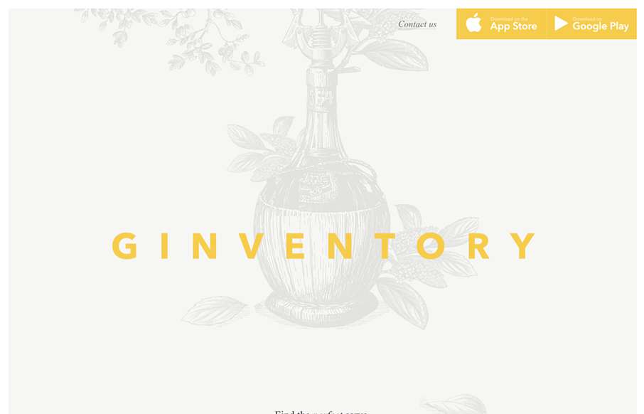
by Aaron Griswold | Oct 28, 2015 | Gallery
Ok… throw out your old, stodgy, bootstrapped App Product Pages… Ginventory out of Brussels just broke the mold. Cool transitions and great video capture of the app itself, all in a beautifully designed container.