by Gene Crawford | Sep 2, 2015 | Gallery
Simple approach to this website, but I love it. I love the big header image, it’s fun and feels fresh. Then the rest of the content is really straight forward but probably all you need for a site like this.
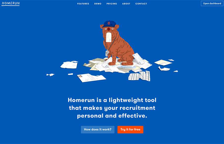
by Aaron Griswold | Sep 2, 2015 | Gallery
Love this simple site with some cool bulldog (kind of) flat illustrations. Besides liking the site – I really like the way the actual app looks and works – there is a Bootstrap element to it – but it’s clean and makes sense – even has...
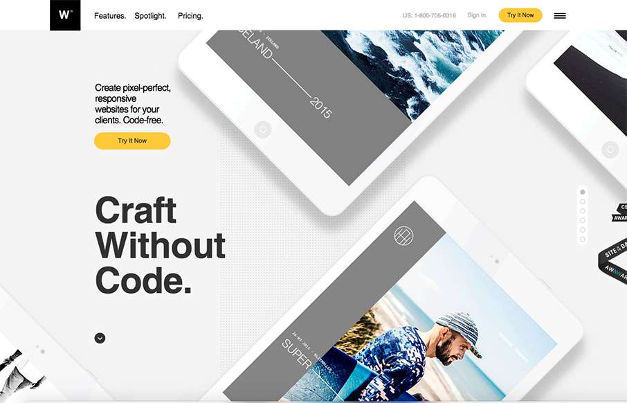
by Gene Crawford | Sep 2, 2015 | Gallery
Pretty nifty visual narrative on the home page of the webydo.com website here. I like how the photos follow you down the page through the various processes you’ll go through in editing a website with this product. The overall design is slick too. Much...
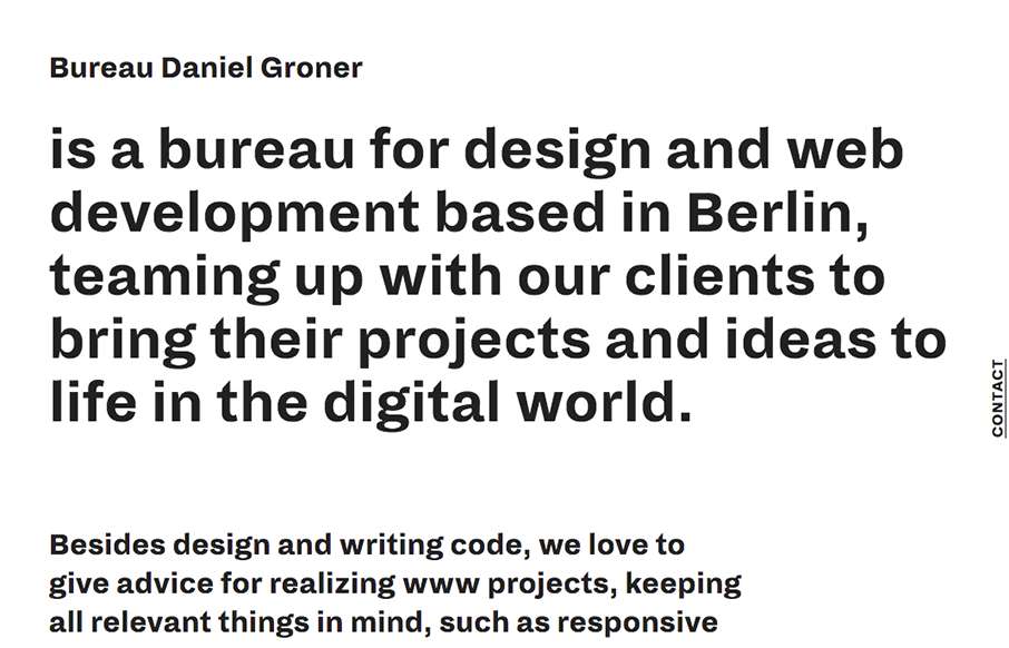
by Gene Crawford | Sep 1, 2015 | Gallery, Portfolio
The vibe of this site design is very unique feeling to me. I like that it’s 90% copy as you first load the thing then the layout of the elements are unique. I like the mouse over effect on the main images as you move around on the page too.
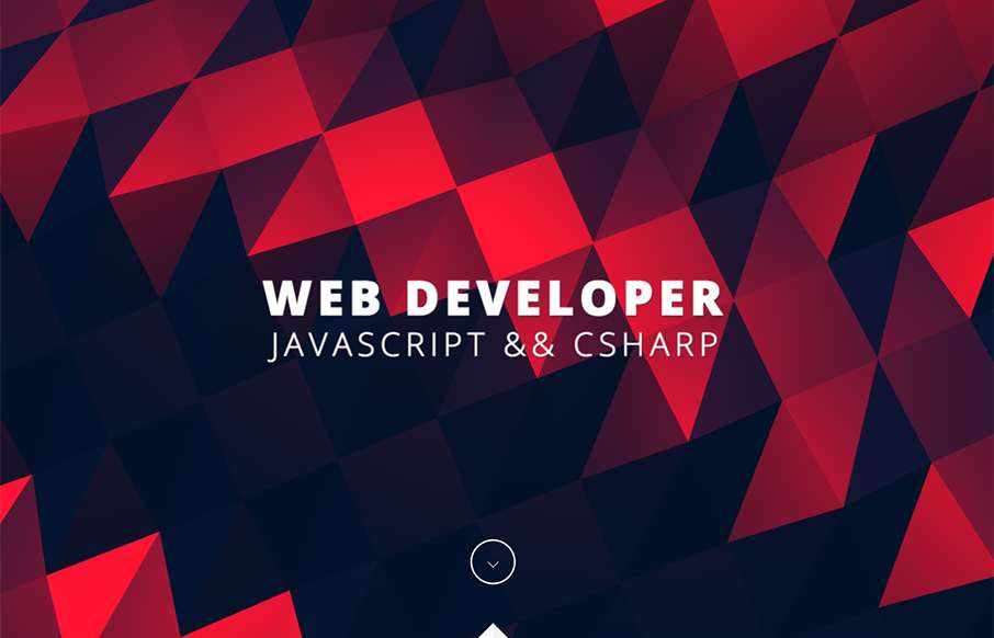
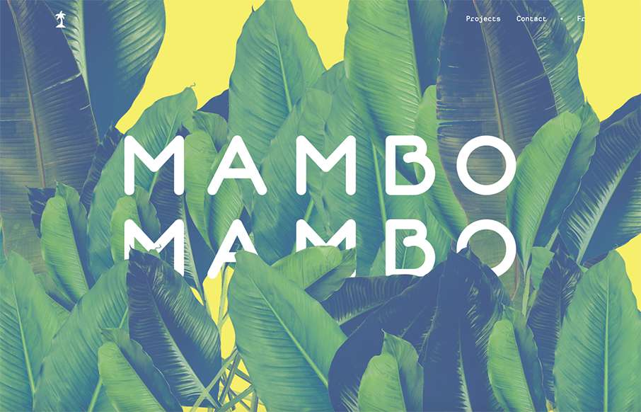
by Gene Crawford | Sep 1, 2015 | Gallery, Portfolio
I love, love, love that header/hero area background. I dig the way the rest of the page loads for you too. It’s just a simple portfolio/resume website and it’s just that, simple. But still powerful feeling.