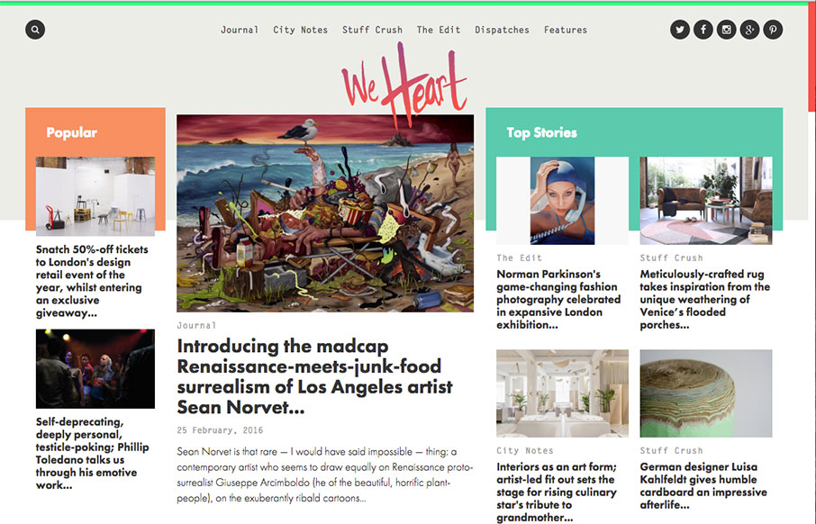
by Gene Crawford | Feb 25, 2016 | Gallery
This digital magazine / newspaper from We Heart out of Barcelona and London is pretty sweet. It’s a great example of our “old timey” blogs have evolved into robust and exciting centers of knowledge – and with so much content, I think...
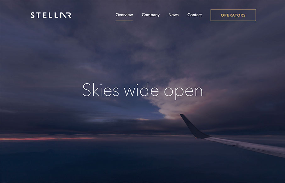
by Aaron Griswold | Feb 24, 2016 | Gallery, Travel
I think this is a cool site – Stellare.aero out of Palo Alto – a digital marketplace for private aviation. Very clean and airy with cool animation and video. Also really like the color combination / palette and animated icons on the Operator page.
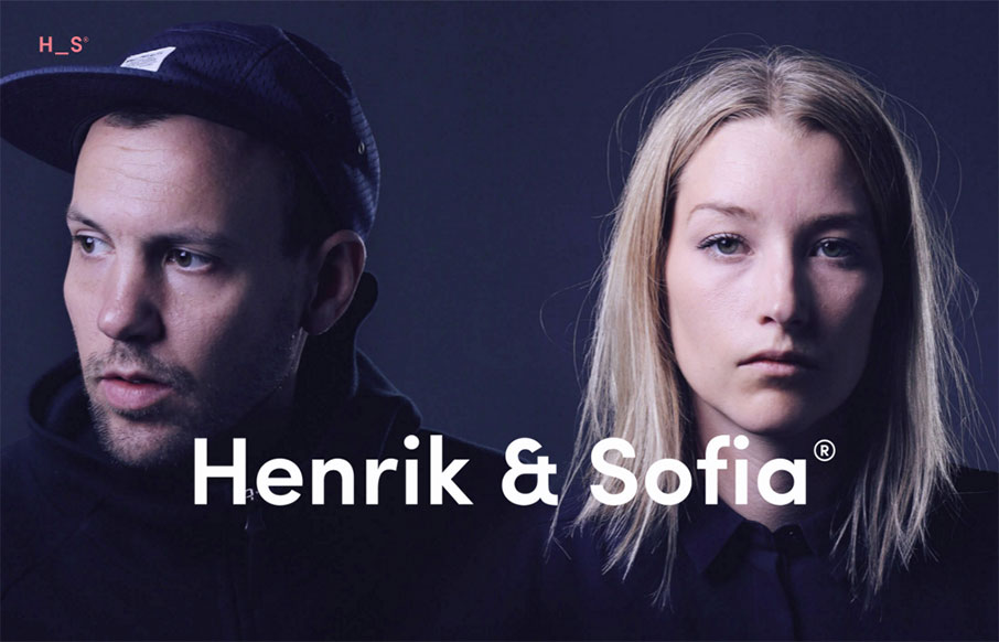
by Aaron Griswold | Feb 23, 2016 | Design Firm, Gallery
Bold site from Henrik and Sofia out of Sweden. I like the “cheekiness” of the design of the Selected Work as you go down the page. Good work on the portfolio / work detail pages too.
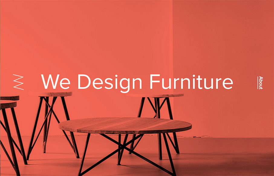
by Aaron Griswold | Feb 23, 2016 | Gallery
Out of Berlin – Nut & Woods’ site is pretty tight. The best thing about the site has to be the navigation – hover over the “Tables” nav item – see the “dropdown” – but then (since they are selling stuff) the...
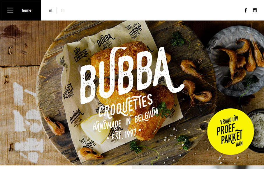
by Aaron Griswold | Feb 22, 2016 | Food and Beverage, Gallery
Good looking block design site fro Bubba Croquettes by Skinn out of Bruges, Belgium. Two things I especially like – first – the hamburger menu drawer opens to just the nav items – not to this huge overlay. Then second – I like how the footer...