by Gene Crawford | May 10, 2013 | Gallery
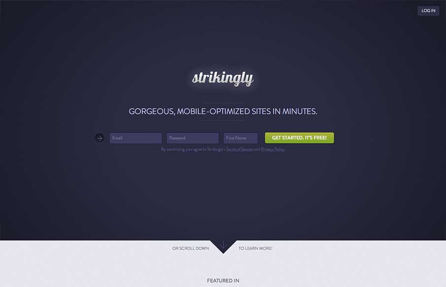
I like the minimal approach mixed with the full on product tour in the middle section of this site design. You start and finish with the same form layout as you scroll through the page. I also study sign up forms a good deal and I like the horizontal layout of the...
by Jay Barry | May 10, 2013 | Gallery
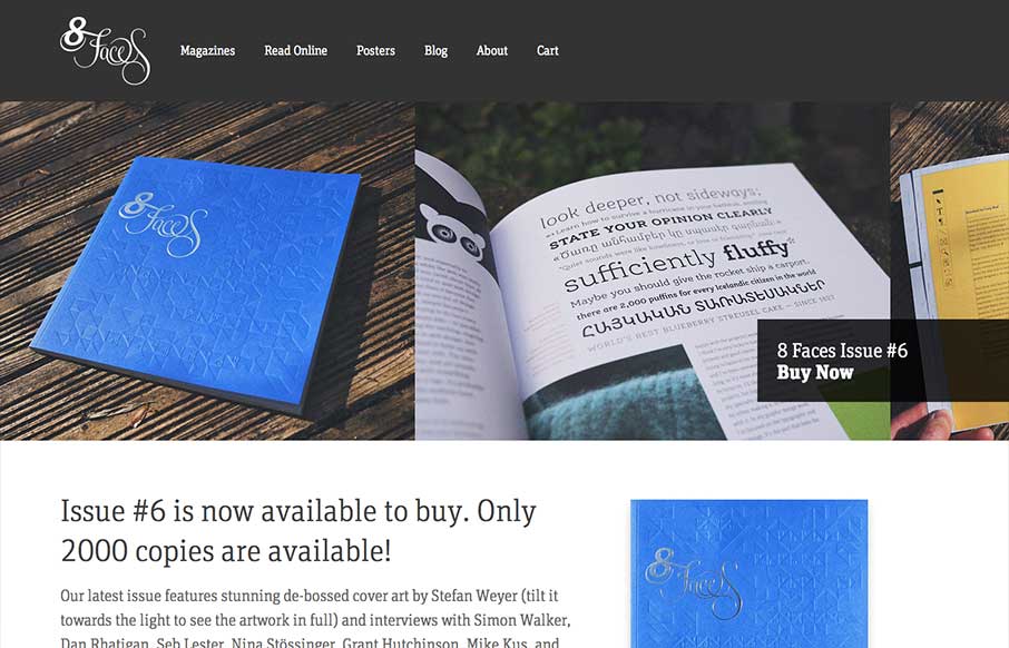
The whole point and appeal of 8 Faces is the tactile, printed objects that they produce, so much so that the website might seem like an afterthought regardless of how well it’s designed. Luckily it’s a great example of simple, effective design. The purpose...
by Maria | May 8, 2013 | Gallery
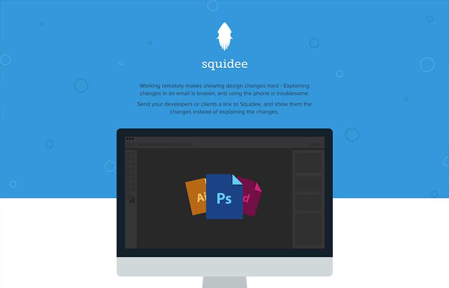
Squidee helps designers send PSDs to frontend developers. The aesthetic of this site is pretty nice. There’s a very clean use of shape and color which is balanced nicely with the amount and prominence of the type. I like the progression of content, and I dig the...
by Gene Crawford | May 7, 2013 | Gallery
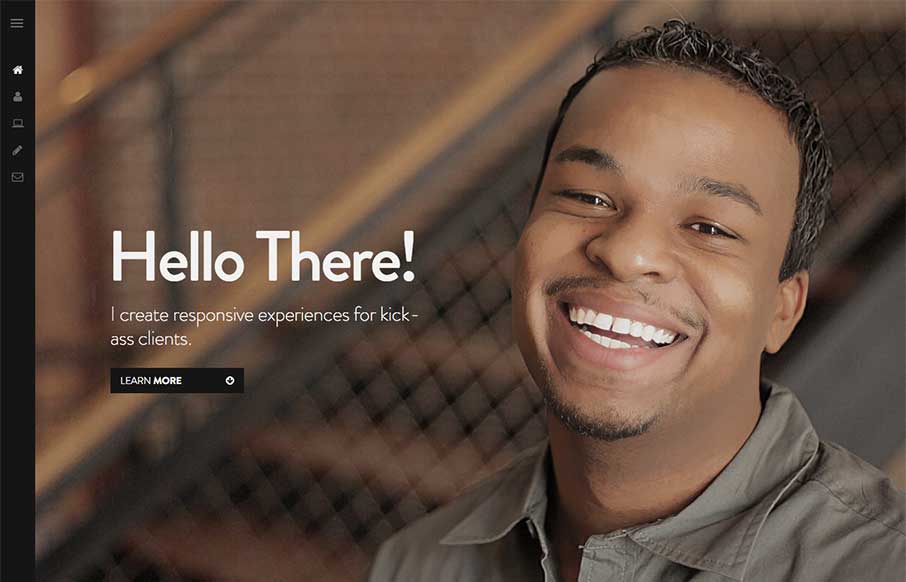
I like how the site is designed to be deceptively simple. It starts off with what looks like just a big head shot of Nathaniel but then as you click around you notice it’s intricacies and how the side nav is design. Then you start to scroll and notice the load...
by Gene Crawford | May 6, 2013 | Gallery
I really like all the detail work put into this design. It’s well done visually, the visual branding is superb, and it’s also executed well from a build p.o.v. I like the fixed nav and how it fades into view as well as the simple approach to how the site...
