by Aaron Griswold | Aug 6, 2014 | Gallery
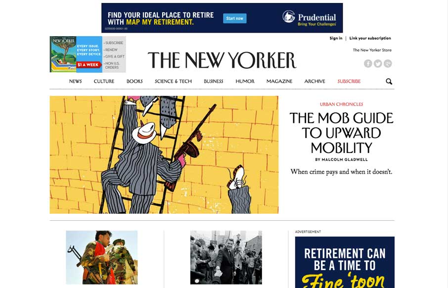
We’ve watched over the years as purveyors of print have made uneasy transitions to the web. Last week, the redesign The New Yorker’s website shows they’ve worked hard to translate their magazine into the modern interwebs. Great use of the images and...
by Aaron Griswold | Aug 6, 2014 | Gallery, Sports/Recreation
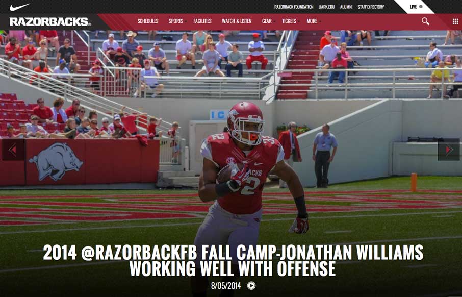
Football (Gridiron) season is in a couple of weeks. Even though this isn’t my favorite team, really like their website. The large images and videos give it a bold and loud feeling, that translates really well if you’re a fan.
by Aaron Griswold | Aug 5, 2014 | Gallery
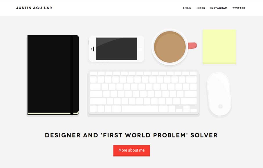
Really like Justin’s use of navigation, both in the Work section, and in the header. It’s different, active, animated, and gets away from the proverbial hamburger menu icon – which is always a good thing. The rest of the site is clean and crisp, with...
by Gene Crawford | Aug 5, 2014 | Gallery
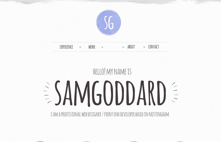
Cool portfolio site that looks like Sam is into trying out new stuff – including some nice animations and icon work. Like in the Work areas how he specifically refers to what skills he used per project, instead of a nebulous skill set dashboard like most...
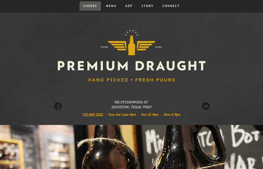
by Aaron Griswold | Aug 4, 2014 | Food and Beverage, Gallery
A good one page site that seems to be an extension of the growler fill station itself (making the site background / tecture look like the chalkboards in the store). In the mobile version, they’ve made the menu more accessible for your phone, without resorting to...