by Gene Crawford | Oct 28, 2016 | Gallery, Marketing Company
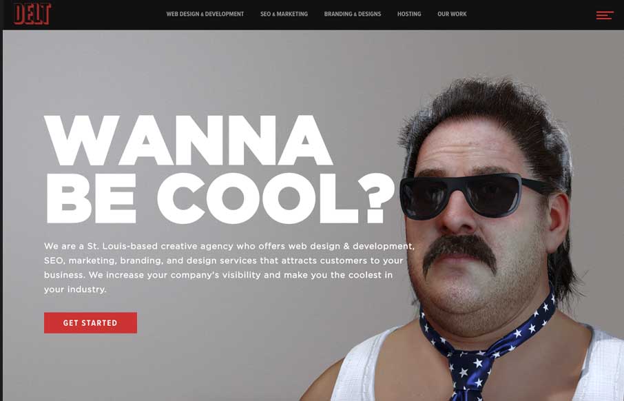
Fun imagery help deliver a pretty standard agency message and it works great. The best feature, once you get to it, is the fly-out nav. I love how it’s basically a small site map but they’ve also broken out the major areas of focus for the agency at the...

by Gene Crawford | Oct 27, 2016 | Gallery, Marketing Company
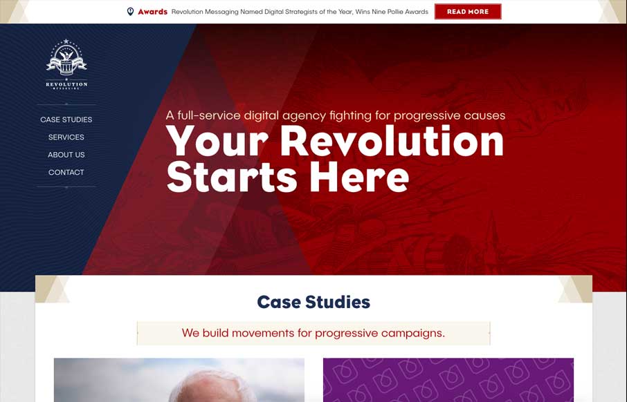
You’ve got to love commitment to a good theme. The Revolution Messaging website delivers on that in such a solid way. I love almost every detail of this website. The way it loads items as you get down the page and the way there are tiny little interactions baked...

by Gene Crawford | Oct 27, 2016 | Gallery, Portfolio
Really solid portfolio website for Brittany Chiang. I love the timeline layout section and the case studies are well done. All you need do is just scan down this site and you know all you need to know. Great design work all around here! Submitted by: Brittany Chiang...

by Gene Crawford | Oct 26, 2016 | Gallery
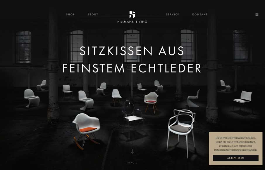
Nice clean layout for the Hillman Living website. I love the way the image fades in with those color chairs on that dark background. Cool effect there. I also like the way the first section of product images are worked onto the page. It’s chock full of visual...

by Gene Crawford | Oct 26, 2016 | Gallery, Portfolio
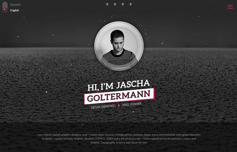
Wow. That’s about all that goes through my mind as I check this page out for the first time. What great CSS animation work on the main photo area. Solid layout and detail work. Hire this man! From the Designer: I am a Berlin based graphic designer and I create...
